[solvers] Shorten lengthy return types#23808
[solvers] Shorten lengthy return types#23808jwnimmer-tri merged 7 commits intoRobotLocomotion:masterfrom
Conversation
Shorten lengthy return types to fix Doxygen's pages by:
1) Migrating some declarations from `std::enable_if` to `requires`
2) Using trialing return types
 jwnimmer-tri
left a comment
jwnimmer-tri
left a comment
There was a problem hiding this comment.
@jwnimmer-tri reviewed 4 of 4 files at r1, all commit messages.
Reviewable status: 3 unresolved discussions, LGTM missing from assignee jwnimmer-tri(platform), needs at least two assigned reviewers
solvers/non_convex_optimization_util.h line 166 at r1 (raw file):
    -> std::tuple<Binding<LinearConstraint>,
                  std::vector<Binding<RotatedLorentzConeConstraint>>,
                  VectorXDecisionVariable>;
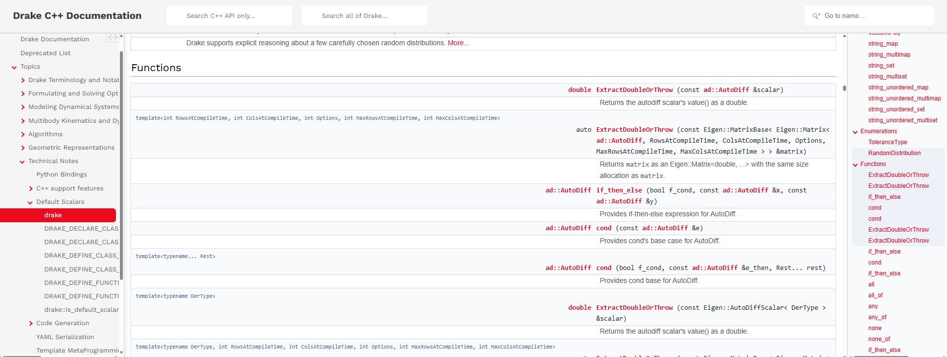
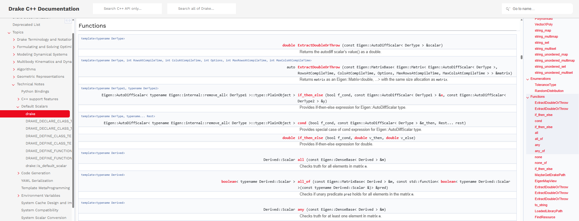
So this is a definite improvement to the "Functions" summary table, but now at the function detail page http://127.0.0.1:8000/doxygen_cxx/group__solver__evaluators.html#ga70dab8652a66b1411ea56edef4b0b995, we end up with a too-wide table such that the longform description ends up with an annoying scrollbar.
I pushed a CSS fix for this to your branch (be sure to pull it locally before you make any further changes).
solvers/mathematical_program.h line 3158 at r1 (raw file):
   * @throws std::exception if the pre condition is not satisfied.
   */
nit Remove newly-added spurious blank line between comment and function.
solvers/mathematical_program_result.h line 190 at r1 (raw file):
  [[nodiscard]] typename std::enable_if_t<
      std::is_same_v<typename Derived::Scalar, symbolic::Variable>,
      MatrixLikewise<double, Derived>>
BTW Several of the member functions on MathematicalProgramResult have the same "enable_if makes the table layout unreadable" problem, e.g., GetSolution here.
Shall we also try to fix those in this PR?
jwnimmer-tri
left a comment
There was a problem hiding this comment.
@jwnimmer-tri reviewed 1 of 1 files at r2, all commit messages.
Reviewable status: 3 unresolved discussions, LGTM missing from assignee jwnimmer-tri(platform), needs at least two assigned reviewers, commits need curation (https://drake.mit.edu/reviewable.html#curated-commits) (waiting on @j4yyousi)
|
Hi @jwnimmer-tri, did you get a chance to review the updates? |
jwnimmer-tri
left a comment
There was a problem hiding this comment.
Everything but the CSS looked fine. I got stuck trying to figure out how to review the CSS. See new discussion thread, below.
@jwnimmer-tri reviewed 2 of 3 files at r3, all commit messages.
Reviewable status: 1 unresolved discussion, LGTM missing from assignee jwnimmer-tri(platform), needs at least two assigned reviewers, commits need curation (https://drake.mit.edu/reviewable.html#curated-commits) (waiting on @j4yyousi)
doc/doxygen_cxx/doxygen_extra.css line 85 at r3 (raw file):
}

td.memItemLeft {
I am having trouble understanding the effect of this additional CSS.
Please provide me with one or sample pages (like "mathematical program class" or "solvers namespace") and explain where I should compare to see the effect (e.g., which function names or etc). I'll open the page with this css and then remove the css and look again. By comparing the two, I'll be able to understand what the CSS doing.
(In both cases, I will use the content of this PR for comparing, i.e., with the requires re-spellings already done.)
|
Hi, here are instructions on how to view the effect of the CSS in http://127.0.0.1:8000/doxygen_cxx/classdrake_1_1solvers_1_1_mathematical_program.html as an example:

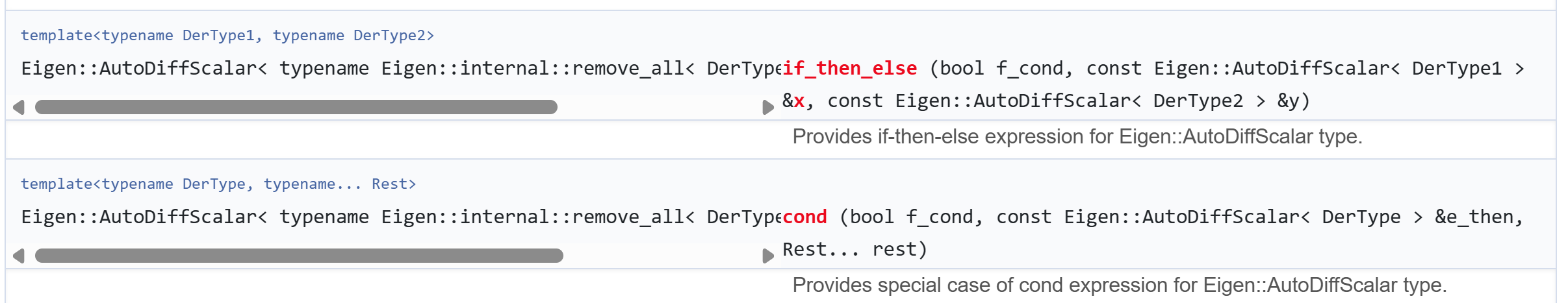
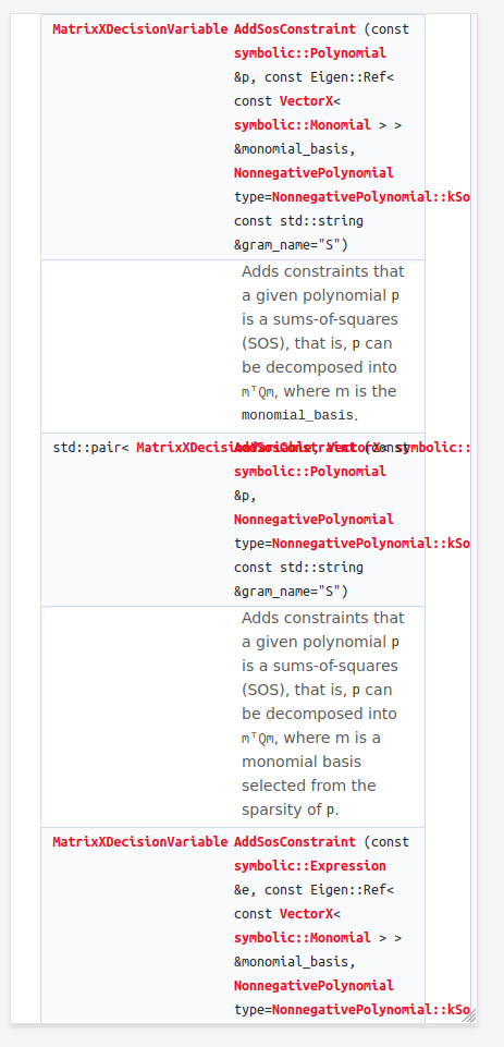
 With the CSS applied, you can see that the return types will have horizontal scroll bars, while the function names and parameters are fully visible.
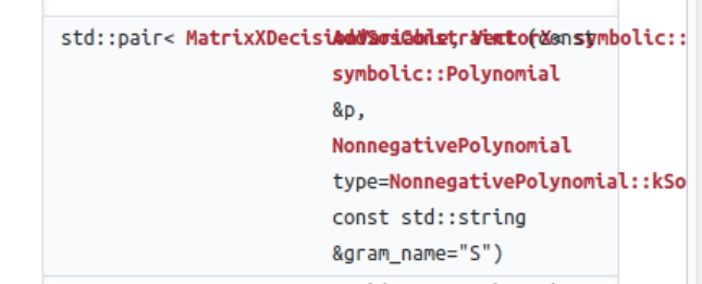
 Where the long return types push the function name and its parameters out of sight and you will have to use the table's horizontal scroll bar.
Actually you can see the effect on any page by narrowing function declarations enough. Here's another page with long-return-type functions : |

|
The only sticking point here is the CSS layout changes. Reviewing (locally testing) that part is taking some time. If you would like to land this PR sooner than later, you could revert the the CSS edit and I could land the PR as-is with just the nice API fixups. Then we could revisit the CSS layout in a second PR. Or if you're not in a hurry, it's fine to leave it all-on-one here and I'll circle back time permitting. |
|
No worries take your time. I'll leave the PR as is unless instructed otherwise. |
 tyler-yankee
left a comment
tyler-yankee
left a comment
There was a problem hiding this comment.
@tyler-yankee reviewed 5 files and all commit messages, and made 2 comments.
Reviewable status: 2 unresolved discussions, LGTM missing from assignees jwnimmer-tri(platform),tyler-yankee, commits need curation (https://drake.mit.edu/reviewable.html#curated-commits) (waiting on @j4yyousi).
doc/doxygen_cxx/doxygen_extra.css line 85 at r3 (raw file):
Previously, jwnimmer-tri (Jeremy Nimmer) wrote…
I am having trouble understanding the effect of this additional CSS.
Please provide me with one or sample pages (like "mathematical program class" or "solvers namespace") and explain where I should compare to see the effect (e.g., which function names or etc). I'll open the page with this css and then remove the css and look again. By comparing the two, I'll be able to understand what the CSS doing.
(In both cases, I will use the content of this PR for comparing, i.e., with the
requiresre-spellings already done.)
See my top-level thread for an example of what this PR does on a page unrelated to the solvers changes.
a discussion (no related file):
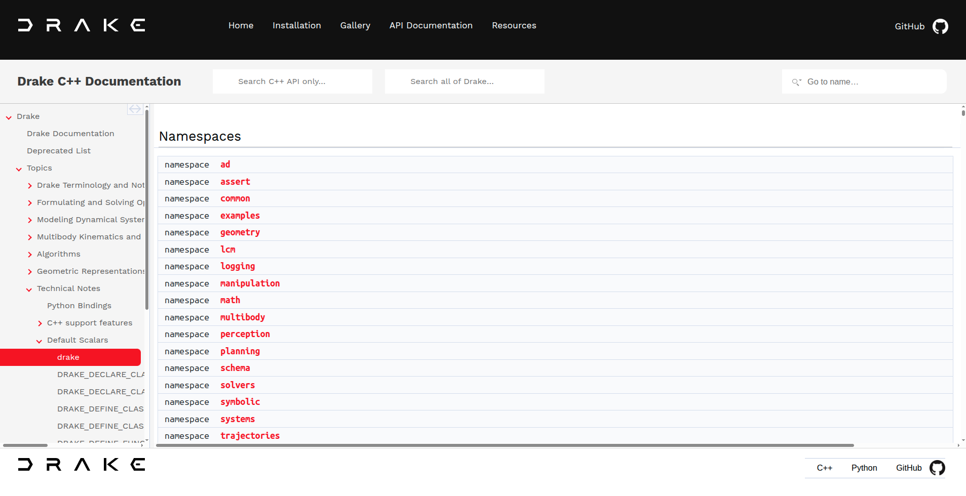
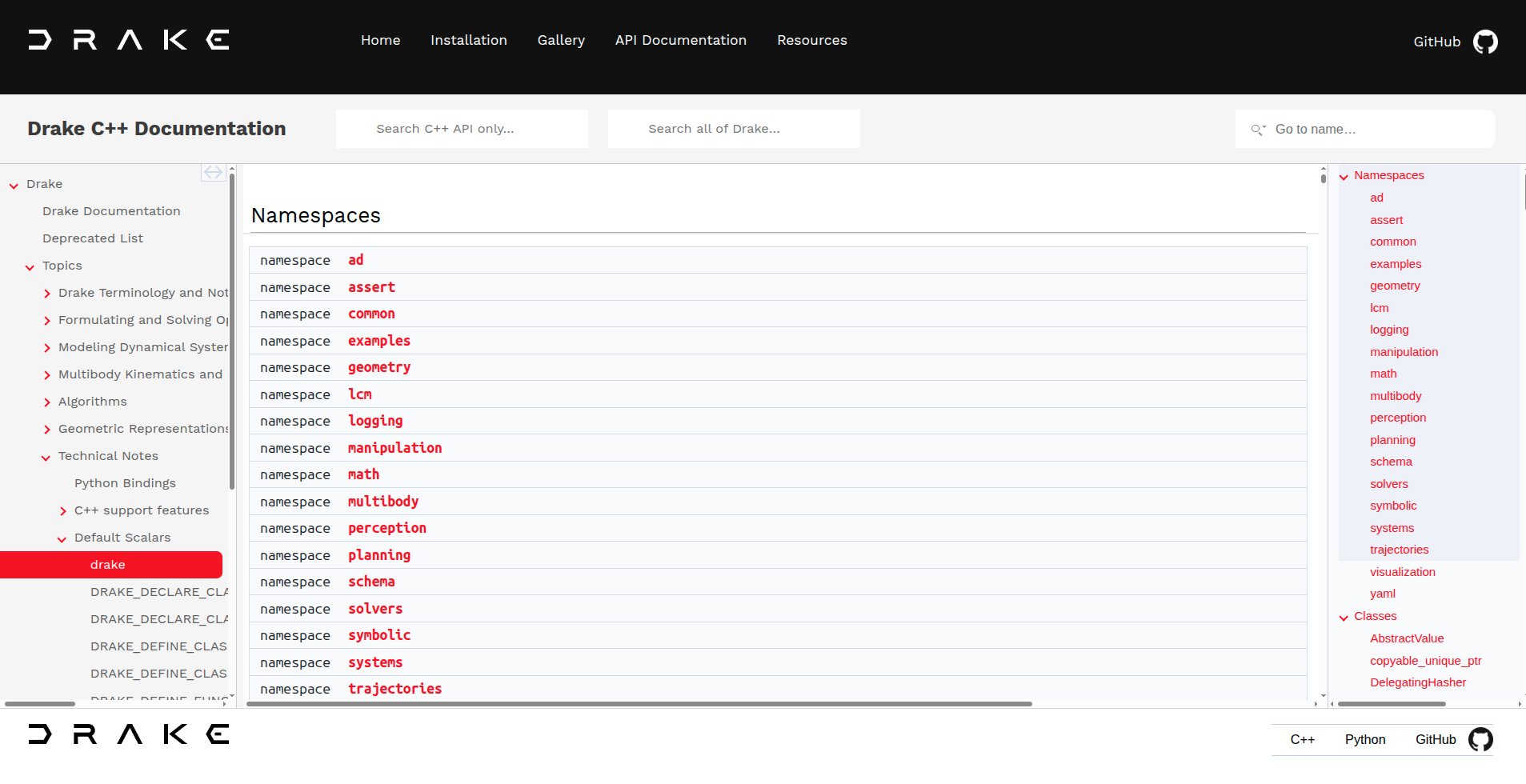
BTW, one could make a similar argument regarding readability for the drake Namespace Reference page (https://drake.mit.edu/doxygen_cxx/namespacedrake.html). Screenshot from a 27" wide monitor on the currently rendered site from master as of writing:
I understand this page has a lot more "stuff" to account for than drake::solvers::MathematicalProgram, but point still stands.
With this PR, you get something like:
I also noticed that the navigation on the right was gone by default with the PR but present by default on master; I had to grab and widen/open it with the mouse. I imagine that menu can be useful for some longer pages and some might miss that it still exists if it's hidden.
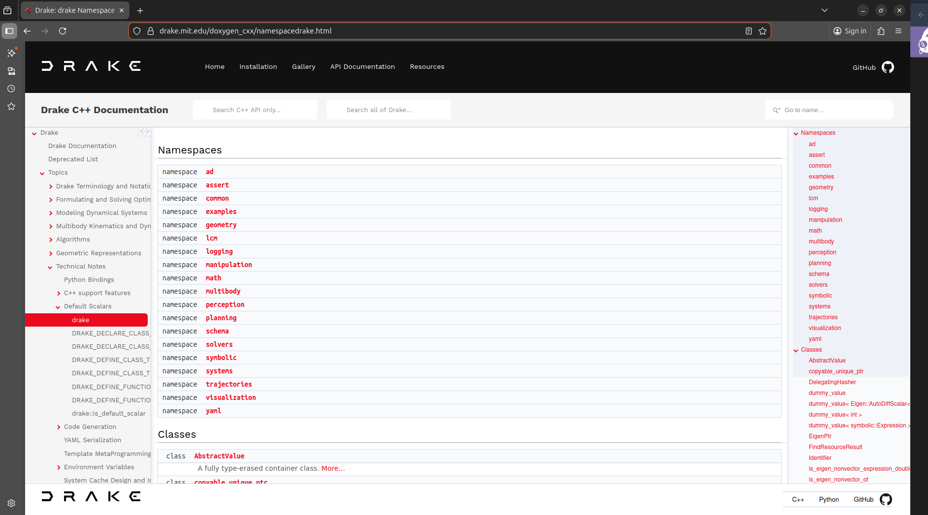
Note that on a smaller screen (e.g. my laptop instead of wide monitor) this creates some scroll bars for longer return types, a la:
I think this is intended based on the commit message? But wanted to point it out for review's sake.
My 2c: the solvers changes and the CSS changes are somewhat distinct, and could be landed as separate PRs. At the very least IMO the PR title+description (resulting commit message on master) should be pivoted to be more of a documentation change, since it's affecting the styling of the entire website.
|
Hi Tyler, opening https://drake.mit.edu/doxygen_cxx/namespacedrake.html using chrome on master shows the page without the navigation bar on the right for me: I had to drag the bar manually to show it: When I open the link using Firefox, the right bar is expanded by default: Looks like this issue is browser dependent, and independent of the PR since it persists on master. Do you mind confirming on this part?
Yes correct. Having the horizontal scroll bar in the left column makes the right column have fixed size. Which makes the table accommodate resizing. |
tyler-yankee
left a comment
There was a problem hiding this comment.
@tyler-yankee made 1 comment.
Reviewable status: 2 unresolved discussions, LGTM missing from assignees jwnimmer-tri(platform),tyler-yankee, commits need curation (https://drake.mit.edu/reviewable.html#curated-commits) (waiting on @j4yyousi).
a discussion (no related file):
Looks like this issue is browser dependent, and independent of the PR since it persists on master.
Interesting. I typically use Chrome, but even incognito Chrome or Firefox I still always get the right bar. Perhaps it's something cached in the browser. I think I'm satisfied with that as long it's observably unaffected by this PR somewhere.
Having the horizontal scroll bar in the left column makes the right column have fixed size. Which makes the table accommodate resizing.
Thanks for clarifying!
 tom-osika
left a comment
tom-osika
left a comment
There was a problem hiding this comment.
@tom-osika made 2 comments.
Reviewable status: 3 unresolved discussions, LGTM missing from assignees jwnimmer-tri(platform),tyler-yankee, commits need curation (https://drake.mit.edu/reviewable.html#curated-commits) (waiting on @j4yyousi).
a discussion (no related file):
Previously, tyler-yankee (Tyler Yankee) wrote…
Looks like this issue is browser dependent, and independent of the PR since it persists on master.
Interesting. I typically use Chrome, but even incognito Chrome or Firefox I still always get the right bar. Perhaps it's something cached in the browser. I think I'm satisfied with that as long it's observably unaffected by this PR somewhere.
Having the horizontal scroll bar in the left column makes the right column have fixed size. Which makes the table accommodate resizing.
Thanks for clarifying!
Adding another piece to the puzzle: I tried this out myself in 3 incognito tabs (chrome, Firefox, and Microsoft edge) and between this branch and master, I always got the right bar. If I didn't open in an incognito tab, the behavior was much less consistent (sometimes it would be there on one browser but not the other).
a discussion (no related file):
On firefox when viewed from mobile, there's some squashing of letters for documentation entries that otherwise would have a scroll bar. See below:
Note that this also happens when viewed in landscape.
Otherwise, the scrollbar works on mobile. Here's a demo in landscape and portrait on chrome (edge looked basically the same)
chrome_landscape_demo.webm
tyler-yankee
left a comment
There was a problem hiding this comment.
@tyler-yankee made 1 comment and resolved 1 discussion.
Reviewable status: 2 unresolved discussions, LGTM missing from assignees jwnimmer-tri(platform),tyler-yankee,tom-osika, commits need curation (https://drake.mit.edu/reviewable.html#curated-commits) (waiting on @j4yyousi).
a discussion (no related file):
Previously, tom-osika (Tom Osika) wrote…
Adding another piece to the puzzle: I tried this out myself in 3 incognito tabs (chrome, Firefox, and Microsoft edge) and between this branch and master, I always got the right bar. If I didn't open in an incognito tab, the behavior was much less consistent (sometimes it would be there on one browser but not the other).
Thanks for checking this, Tom! Sounds like the bar is unaffected by the PR then
 j4yyousi
left a comment
j4yyousi
left a comment
There was a problem hiding this comment.
@j4yyousi made 2 comments.
Reviewable status: 3 unresolved discussions, LGTM missing from assignees jwnimmer-tri(platform),tyler-yankee,tom-osika, commits need curation (https://drake.mit.edu/reviewable.html#curated-commits) (waiting on @j4yyousi).
a discussion (no related file):
Previously, tom-osika (Tom Osika) wrote…
On firefox when viewed from mobile, there's some squashing of letters for documentation entries that otherwise would have a scroll bar. See below:
Note that this also happens when viewed in landscape.
Otherwise, the scrollbar works on mobile. Here's a demo in landscape and portrait on chrome (edge looked basically the same)
chrome_landscape_demo.webm
Thanks for testing Tom!
tyler-yankee
left a comment
There was a problem hiding this comment.
@tyler-yankee reviewed 1 file and all commit messages, and made 1 comment.
Reviewable status: 3 unresolved discussions, LGTM missing from assignees jwnimmer-tri(platform),tyler-yankee,tom-osika, commits need curation (https://drake.mit.edu/reviewable.html#curated-commits) (waiting on @j4yyousi).
a discussion (no related file):
Previously, j4yyousi (Khaled Al-jayyousi) wrote…
Thanks for testing Tom!
@j4yyousi is there anything that can be done to mitigate this? The method in the middle there might as well be unreadable/useless on mobile with the changes.
(To clarify, while I'm generally favor of the styling changes for readability throughout the rest of the site, this effect is a real booger.)
 williamjallen
left a comment
williamjallen
left a comment
There was a problem hiding this comment.
The CSS itself looks reasonable to me, but I'll defer to others for comments on whether the UI looks the way it should.
@williamjallen reviewed 5 files and all commit messages, and made 1 comment.
Reviewable status: 3 unresolved discussions, LGTM missing from assignees jwnimmer-tri(platform),tyler-yankee,tom-osika, commits need curation (https://drake.mit.edu/reviewable.html#curated-commits) (waiting on @j4yyousi).
williamjallen
left a comment
There was a problem hiding this comment.
@williamjallen resolved 1 discussion.
Reviewable status: 2 unresolved discussions, LGTM missing from assignees jwnimmer-tri(platform),tyler-yankee,tom-osika, commits need curation (https://drake.mit.edu/reviewable.html#curated-commits) (waiting on @j4yyousi).
tyler-yankee
left a comment
There was a problem hiding this comment.
I've pushed a merge commit to bring the branch "up to speed" (upgrade to Bazel 9 and some arch-related rcfile changes have since landed on master, which makes the old branch slightly annoying to work off of), and a small commit to adjust the height/thickness of the scrollbar. It makes it more consistent with the thickness of other scrollbars on the page, and makes it generally look less awkward compared with the height of the textbox for the method.
@tyler-yankee made 1 comment.
Reviewable status: 2 unresolved discussions, LGTM missing from assignees jwnimmer-tri(platform),tyler-yankee,tom-osika, commits need curation (https://drake.mit.edu/reviewable.html#curated-commits) (waiting on @j4yyousi).
tyler-yankee
left a comment
There was a problem hiding this comment.
pending the other open thread. I'd also ideally like to see the PR description (or really just the extended commit message when merged), and possibly the title, modified to indicate the scope of the CSS changes. Thanks for your effort on this, Khaled!
@tyler-yankee made 1 comment.
Reviewable status: 2 unresolved discussions, LGTM missing from assignees jwnimmer-tri(platform),tom-osika, commits need curation (https://drake.mit.edu/reviewable.html#curated-commits) (waiting on @j4yyousi).
Previously, tyler-yankee (Tyler Yankee) wrote…
I'll investigate further and get back hopefully by the weekend. |
Previously, j4yyousi (Khaled Al-jayyousi) wrote…
I have tested the CSS on my Iphone and got a different result for Firefox with no overlapping text, but the horizontal scroll bar has a white color which is difficult to see: And here is the same page for chrome: Since the horizontal scrollbar is only visible while scrolling on mobile, the UI is less intuitive than on desktop. Also, the added CSS is interpreted differently by the browsers leading to inconsistent views. Thus, I'll revert my CSS changes. On Iphone, the reverted page will look like this on Firefox and Chrome: |
tyler-yankee
left a comment
There was a problem hiding this comment.
@tyler-yankee made 1 comment.
Reviewable status: 2 unresolved discussions, LGTM missing from assignees jwnimmer-tri(platform),tom-osika, commits need curation (https://drake.mit.edu/reviewable.html#curated-commits) (waiting on @j4yyousi).
a discussion (no related file):
Since the horizontal scrollbar is only visible while scrolling on mobile, the UI is less intuitive than on desktop.
https://stackoverflow.com/questions/68988224/scrollbar-css-not-showing-on-iphone-chrome-and-safari may be relevant here? This may just be a Safari browser-thing, I'm not sure there's much our project styling can control.
Personally, I'd still be in favor of keeping the CSS changes, but author's discretion / open to other reviewers' thoughts.
|
Yeah it doesn't look like it provides a solution for all browsers. Regarding Tom's overlapping text issue: My understanding is that new html elements cannot be added in Doxygen's generated files. Otherwise, adding a
If the side effects on mobile browsers can be ignored, then sure we can proceed with the CSS changes. Otherwise, the shortening of function signatures should be sufficient for now. What do you think? |
jwnimmer-tri
left a comment
There was a problem hiding this comment.
@jwnimmer-tri reviewed 3 files and all commit messages, made 2 comments, resolved 2 discussions, and dismissed @tom-osika and @tyler-yankee from a discussion.
Reviewable status: LGTM missing from assignee tom-osika, commits need curation (https://drake.mit.edu/reviewable.html#curated-commits) (waiting on j4yyousi).
a discussion (no related file):
Previously, j4yyousi (Khaled Al-jayyousi) wrote…
Yeah it doesn't look like it provides a solution for all browsers. Regarding Tom's overlapping text issue:
It is the result of having a fixed table layouttable-layout: fixed;indoxygen_extra.css. The fixed table layout is necessary to show the horizontal scroll bars.My understanding is that new html elements cannot be added in Doxygen's generated files. Otherwise, adding a
<div>inside table cell elements<td>might be sufficient to providing a consistent view across browsers.Personally, I'd still be in favor of keeping the CSS changes...
If the side effects on mobile browsers can be ignored, then sure we can proceed with the CSS changes. Otherwise, the shortening of function signatures should be sufficient for now. What do you think?
The CSS changes have been reverted, so I'll close this thread.
Shorten lengthy return types to fix Doxygen's pages by:
1) Migrating some declarations from `std::enable_if` to `requires`
2) Using trialing return types

Also in the CSS, allow line wrapping in trailing return types.

Co-authored-by: Jeremy Nimmer <jeremy.nimmer@tri.global>
Closes #18161, closes #11317.
Shorten lengthy return types to fix Doxygen's pages by:
std::enable_iftorequiresThis change is
Effect of this PR on

/doxygen_cxx/namespacedrake_1_1solvers.html#18161 :Effect of this PR on

/doxygen_cxx/classdrake_1_1solvers_1_1_mathematical_program.html#11317: