

📖 ¿Hablas español? La documentación también está disponible en español: README en Español
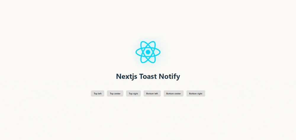
🚀 Nextjs Toast Notify is the ultimate library for modern web notifications. Transform your boring alerts into elegant and customizable toasts with just a single line of code.
What makes it special?
✨ Fast, elegant, and hassle-free - From installation to implementation in less than 1 minute 🎨 Fully customizable - Control every aspect: position, animation, duration, icons, and sounds ⚡ Ultra lightweight - No heavy dependencies, maximum performance 🔧 Plug & Play - Compatible with React, Next.js, Vanilla JS, and any modern framework
Install Nextjs Toast Notify easily with your favorite package manager:
# Using npm
npm install nextjs-toast-notify --save

# Or with yarn
yarn add nextjs-toast-notify
import { showToast } from "nextjs-toast-notify";

function App() {
  const handleShowToast = () => {
    showToast.success("The operation was completed successfully!", {
      duration: 5000,
      progress: true,
      position: "top-right",
      transition: "bounceIn",
      icon: '<svg xmlns="http://www.w3.org/2000/svg" width="20" height="20" viewBox="0 0 24 24" fill="none" stroke="currentColor" stroke-width="1.75" stroke-linecap="round" stroke-linejoin="round" class="lucide lucide-check"><path d="M20 6 9 17l-5-5"/></svg>',
      sound: true,
    });
  };

  return <button onClick={handleShowToast}>Show Toast</button>;
}

export default App;
For Next.js 13+ (App Router): Simply add "use client" at the top of your component — and that’s it! The toast will work perfectly on the client.
"use client"; // This indicates the component will be rendered on the client
import { showToast } from "nextjs-toast-notify";

// Main Next.js component
export default function App() {

  // Event handler to show the toast
  const handleShowToast = () => {
    showToast.success("The operation was completed successfully!");
  };

  return (
    <button onClick={handleShowToast}>Show Toast</button>
  );
}
You can also include Nextjs Toast Notify directly in your project using a CDN link. Follow these steps:
<!DOCTYPE html>
<html lang="en">
  <head>
    <meta charset="UTF-8" />
    <meta name="viewport" content="width=device-width, initial-scale=1.0" />
    <title>Nextjs Toast Notify with CDN</title>
  </head>
  <body>
    <button id="show-toast">Show Toast</button>

    <script src="https://unpkg.com/nextjs-toast-notify@latest/dist/nextjs-toast-notify.min.js"></script>
    <script>
      document.getElementById("show-toast").addEventListener("click", () => {
        showToast.success("Hello to all JavaScript Devs!", {
          duration: 5000,
          position: "top-right",
          transition: "swingInverted",
          icon: "",
          sound: true,
        });
      });
    </script>
  </body>
</html>The Nextjs Toast Notify API allows you to display toast notifications with a wide range of configurations. Below is how to use the available methods and what options you can configure.
Nextjs Toast Notify allows you to display different types of notifications depending on your application's context.
To define the type, simply specify it when calling showToast:
- ✅
showToast.success→ Displays a success toast - ❌
showToast.error→ Displays an error toast ⚠️ showToast.warning→ Displays a warning toast- ⬆️
showToast.info→ Displays an info toast
import { showToast } from "nextjs-toast-notify";

function App() {
  const handleShowSuccessToast = () => {
    showToast.success("Operation successful!"); // 'showToast.success' | 'showToast.error' | 'showToast.info' | 'showToast.warning'
  };

  return <button onClick={handleShowSuccessToast}>Toast Success</button>;
}
export default App;To display notifications in different positions on the screen, specify the position option with one of the following values:
top-left→ Top-left cornertop-center→ Top-centertop-right→ Top-right cornerbottom-left→ Bottom-left cornerbottom-center→ Bottom-centerbottom-right→ Bottom-right corner
Here is an example:
import { showToast } from "nextjs-toast-notify";

function App() {
  const handleToastPosition = () => {
    showToast.success("Operation successful!", {
      position: "top-right",
    });
  };

  return <button onClick={handleToastPosition}>Top Right Toast</button>;
}

export default App;The default duration of notifications is 8 seconds, but you can customize it using the duration option.
- Property:
duration - Type:
number | null - Default:
8000
Behavior of duration:
number: The toast automatically closes after the specified time (in milliseconds)null: The toast uses the default duration (8000ms) for the progress bar, but does NOT close automatically. Requires manual closing by the user
Example with custom duration:
import { showToast } from "nextjs-toast-notify";

function App() {
  const handleShowToast = () => {
    showToast.success("Toast closes in 5 seconds!", {
      duration: 5000,
    });
  };
  return <button onClick={handleShowToast}>Auto-close Toast</button>;
}

export default App;
Example with manual close:
import { showToast } from "nextjs-toast-notify";

function App() {
  const handleShowPersistentToast = () => {
    showToast.warning("This toast requires manual closing!", {
      duration: null,
    });
  };
  return <button onClick={handleShowPersistentToast}>Persistent Toast</button>;
}

export default App;The progress bar is displayed by default, but you can disable it if you prefer.
- Property:
progress - Type:
boolean - Default:
true
Example:
import { showToast } from "nextjs-toast-notify";

function App() {
  const handleShowToast = () => {
    showToast.info("Information toast!", {
      progress: false,
    });
  };
  return <button onClick={handleShowToast}>Show Toast</button>;
}
export default App;The default position is the top-right corner, but you can change it with the position option.
- Property:
position - Type:
'top-left' | 'top-center' | 'top-right' | 'bottom-left' | 'bottom-center' | 'bottom-right' - Default:
'top-right'
Example:
import { showToast } from "nextjs-toast-notify";

function App() {
  const handleToastPosition = () => {
    showToast.success("Centered toast correctly!", {
      position: "top-center",
    });
  };

  return <button onClick={handleToastPosition}>Centered Toast</button>;
}

export default App;Customize the entry and exit animation using the transition option.
- Property:
transition - Type:
'fadeIn' | 'bounceIn' | 'swingInverted' | 'popUp' | 'topBounce' | 'bounceInDown' | 'slideInUp' - Default:
'fadeIn'
Example:
import { showToast } from "nextjs-toast-notify";

function App() {
  const handleToastAnimationPopUp = () => {
    showToast.error("Toast with popUp animation!", {
      transition: "popUp",
    });
  };
  return <button onClick={handleToastAnimationPopUp}>Bounce Toast</button>;
}

export default App;Add a custom icon to enhance the visual identity. If not provided, a default icon based on the notification type will be used.
- Property:
icon - Type:
string
Example:
function App() {
  const handleToastIcon = () => {
    showToast.success("Toast with icon!", {
      icon: "🎉",
    });
  };

  return <button onClick={handleToastIcon}>Toast with icon</button>;
}Enable a sound when showing the notification to better capture user attention.
- Property:
sound - Type:
boolean - Default:
false
Example:
import { showToast } from "nextjs-toast-notify";

function App() {
  const handleToastSound = () => {
    showToast.info("Toast with sound enabled!", {
      sound: true,
    });
  };
  return <button onClick={handleToastSound}>Toast with sound</button>;
}

export default App;import { showToast } from "nextjs-toast-notify";
function App() {
const showNotification = () => {
showToast.success("Operation successful!", {
duration: 4000,
position: "top-center",
transition: "bounceIn",
icon: "🚀",
progress: false,
sound: true,
});
};
return <button onClick={showNotification}>Show Notification</button>;
}
export default App;The notification has a duration of 4 seconds, is centered at the top, with a bounce animation, a custom icon, no progress bar, and sound enabled.
If you find any issue or have an idea to improve the package, please open an issue or submit a pull request on GitHub: https://github.com/urian121/nextjs-toast-notify
Urian Viera 🌐 https://www.urianviera.com 📺 https://www.youtube.com/WebDeveloperUrianViera 💌 urian1213viera@gmail.com ☕ https://www.paypal.com/donate/?hosted_button_id=4SV78MQJJH3VE
© 2024 Urian Viera. All rights reserved.
Licensed under MIT