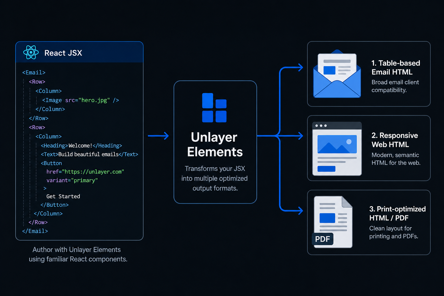
Write once in React. Render emails, web pages, and PDFs from the same component tree.


Unlayer Elements is an open-source React component library that lets you build content once and render it across three output modes:
- Email → Outlook, Gmail, Yahoo, Apple Mail
- Web → Responsive pages and embedded experiences
- Document → Print-ready HTML for PDF generation
Elements is built and maintained by the team behind Unlayer, the content creation platform used by thousands of companies to power email, page, and document experiences inside their products.
| Tool | Web | ||
|---|---|---|---|
| React Email | ✅ | ❌ | ❌ |
| MJML | ✅ | ❌ | ❌ |
| PDF libraries | ❌ | ❌ | ✅ |
| Elements | ✅ | ✅ | ✅ |
Elements is designed for teams that need to generate email, web, and document experiences from a single React codebase.
npm install @unlayer/react-elementsimport {
Email, Row, Column, ColumnLayouts,
Heading, Paragraph, Button, renderToHtml
} from '@unlayer/react-elements';
function WelcomeEmail() {
return (
<Email backgroundColor="#f0f0f0" contentWidth="600px">
<Row layout={ColumnLayouts.OneColumn} backgroundColor="#ffffff" padding="20px">
<Column>
<Heading
fontSize="24px"
fontFamily={{ label: "Arial", value: "arial,helvetica,sans-serif" }}
>
Welcome!
</Heading>
<Paragraph html="Thanks for signing up." fontSize="14px" />
<Button
href="https://example.com"
backgroundColor="#0879A1"
color="#ffffff"
>
Get Started
</Button>
</Column>
</Row>
</Email>
);
}
// Render to a clean HTML string — no React hydration markers
const html = renderToHtml(<WelcomeEmail />);Build content once and render it as email, web, or document. Share components, styling, and content across all three output modes from the same React codebase.
Works with React, Next.js, Remix, and Server Components. Use familiar JSX patterns and existing frontend workflows without learning a new templating language.
Generates email-safe HTML, responsive web HTML, and print-ready HTML for PDF generation — optimized output for each destination without maintaining separate implementations.
Export Unlayer-compatible design JSON with renderToJson() for round-tripping between code and the visual editor. Ideal for teams that want the flexibility of code alongside visual editing workflows.
Built with TypeScript from the ground up — full type definitions, autocomplete for components and props, and safer development with better IDE support.
renderToHtml() generates production-ready HTML with no React hydration markers, no framework artifacts, and no client-side JavaScript required.
~12KB gzipped (under 60KB ESM), tree-shakeable, with zero client-side JavaScript required. Designed for performance-sensitive applications and server-side rendering environments.
Build and maintain order confirmations, password resets, and receipts from the same React codebase that powers your application.
Generate invoices, contracts, and reports server-side without maintaining a separate PDF system.
Render content from a CMS, API, or database into emails, web pages, and documents using a shared component model.
Publish the same content as an email campaign, a web archive, and a public landing page from a single source of truth.
| Component | Description |
|---|---|
<Email> |
Root wrapper — email-safe HTML (tables for Outlook/Gmail) |
<Page> |
Root wrapper — responsive web (div + flexbox) |
<Document> |
Root wrapper — print/PDF optimized |
<Row> |
Layout container with column layout support |
<Column> |
Column inside a Row |
<Button> |
CTA button with hover states and links |
<Heading> |
Heading (h1–h4) |
<Paragraph> |
Rich text with plain text or HTML content |
<Image> |
Responsive image with alt text |
<Divider> |
Horizontal separator |
<Social> |
Social media icon links |
<Menu> |
Navigation menu |
<Table> |
Data table |
<Video> |
YouTube/Vimeo embed |
<Html> |
Custom HTML passthrough |
Components follow a strict hierarchy:
<Email>              ← sets render mode
  <Row layout={…}>   ← layout container
    <Column>         ← must match layout column count
      <Button />     ← content components
      <Paragraph />
    </Column>
  </Row>
</Email>
import { Row, Column, ColumnLayouts } from '@unlayer/react-elements';

// Each Row must contain the matching number of <Column> children.
<Row layout={ColumnLayouts.OneColumn}>                {/* [1]         → 100% */}
  <Column>{/* content */}</Column>
</Row>
<Row layout={ColumnLayouts.TwoEqual}>                 {/* [1,1]       → 50% + 50% */}
  <Column>{/* content */}</Column>
  <Column>{/* content */}</Column>
</Row>
<Row layout={ColumnLayouts.TwoWideNarrow}>            {/* [2,1]       → 67% + 33% */}
  <Column>{/* content */}</Column>
  <Column>{/* content */}</Column>
</Row>
<Row layout={ColumnLayouts.ThreeEqual}>               {/* [1,1,1]     → 33% each */}
  <Column>{/* content */}</Column>
  <Column>{/* content */}</Column>
  <Column>{/* content */}</Column>
</Row>
<Row layout={ColumnLayouts.FourEqual}>                {/* [1,1,1,1]   → 25% each */}
  <Column>{/* content */}</Column>
  <Column>{/* content */}</Column>
  <Column>{/* content */}</Column>
  <Column>{/* content */}</Column>
</Row>
<Row cells={[3, 1]}>                                  {/* custom ratio */}
  <Column>{/* content */}</Column>
  <Column>{/* content */}</Column>
</Row>For the full API reference, component props, design patterns, and common mistakes, see the React package documentation.
| Package | Description | Published |
|---|---|---|
@unlayer/react-elements |
React components and renderers | |
@unlayer-internal/shared-elements |
Framework-agnostic shared logic | Internal |
@unlayer/elements-demo |
Demo application | — |
# Prerequisites: Node.js (see .nvmrc), pnpm 9+

# Install dependencies
pnpm install

# Build all packages
pnpm build

# Run tests
pnpm test

# Run tests with coverage
pnpm test:coverage

# Launch Storybook
pnpm storybook:hubSee CONTRIBUTING.md for setup instructions and guidelines.
MIT — Unlayer, Inc.