Kitchen Catastrophe is a word game aimed at providing light entertainment while also serving to test and better user's knowledge of food and drink vocabulary. Levels begin with 4 and 5 letter words in both the food and drink categories. These build to 5 and 6 letter words in levels 3 and 4. When the user reaches level 5, their unscrambling skills and foodie knowledge is put to the test with a new category; cooking methods. Finally the last level reuires 10 letter words to be solved!

Visit the Kitchen Catastrophe live website here
Kitchen Catastrophe is a fun and light-hearted game aimed at anyone who loves a word problem and/or loves food and drink!
- I want to play an engaging word game
- I want to test my food and drink knowledge
- I want to be able to play on any of my devices
- I want to navigate easily
- I want to test my knowledge on new words
- I want to be able to decide if I can see the clues or not
- I want to be able to start the game without scrolling to the bottom of the homepage
- I want to test my knowledge on new words
This website uses primarily a palette of green and orange colours to reflect a fresh and clean feel. The palette was created using the Coolors website.

Google Fonts was used to source the font styles used throughout the website:
- Andika: Used for the main body of website
- Permanant Marker: Used for the game title only
Andika was chosen as the primary font as it's in keeping with the sense of fun and games.
Permanant Marker was chosen as it feels in keeping with the title itself; 'Kitchen Catastrophe'. It gives a sense of calamity.

Both were also chosen to ensure maximum accessibility.
Images found throughout the website were sourced from Shutterstock. The background image was chosen as it fit with the theme of being fun and whimsical. This background was the base of choice for the rest of the colour palette.
Photographs of real people were used (as opposed to animated/cartoon imagery). This brings a certain adult feel to the game ensuring adults know it's a game for them.
Icons used on the homepage and support page were imported through Font Awesome.
To create the wireframes I used the Balsamiq Wireframing Software.
Homepage (mobile)

Homepage (desktop)

How to Play page (mobile)

How to Play page (desktop)

Game page (mobile)

Game page (desktop)

The website has 3 main pages accessible to the user which; the homepage, the How to Play page where the game instructions can be found, and the Game page itself.
All pages include the following features:
-
Logo: Chefs hat image
-
Navigation bar: Quick links to the game and back to the homepage

- Title: Kitchen Catastrophe
The homepage is very simple and acts as a home base to set the scene for the idea behind the game. Here the user is told the premise; that the chefs need help to unscramble lots of food and drink related words. From here they can click on the call to action button to take them to the 'How to Play' page, or they can use the navigation links at the top of the page to go straight to the game.

This page consists of:
-
Rules The first information the user will see is the rules/instructions. These are very straightforward and simply set out over 3 lines.
-
Icons Icons that represent the 3 categories are illustrated here and also serve to seperate the text of the rules and the levels for better UX.
-
Levels A list highlights what the user can expect in terms of levels and categories
-
Call to action button At the bottom of the page the user can click on the 'Start unscrambling' button to take them into the gameplay.

-
Player Stats The user will be able to see the level they are on, their score, and how many times they have got the answer wrong.
-
Category This changes dependent on the level; either food, drink, or cooking methods. All with a relevant icon.
-
The scrambled word Here the word that is all jumbled appears for the user to solve.
-
User Answer box The user answer box appears with placeholder text so that the user knows where to input their answer. Focus returns to this box after any modals are closed.
-
Clue Hint A clue is provided but only activated by using the toggle button. This means the user has a choice over making the game a little more easy/difficult.
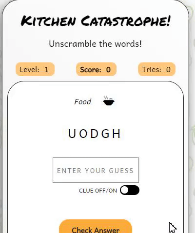
- Buttons Immediately under the clue is the 'Check Answer' button. A stronger font is used for this button to make it stand out better as it will be most frequently used during gameplay.

Dependent on what the user has input for their answer, when the Check Answer button is clicked one of 5 possible modals will show. These include:
- Advises user their answer is correct
- Advises user their answer is incorrect
- Advises user no answer was input
- Advises user they have won the game
- Advises user they have lost the game

I have taken the following steps in order to ensure my site is as accessible as possible:
- Clear and simple font styling, avoiding any cursive or calligraphic scripts for the majority of the text.
- Using complimentary colours
- As the background image is quite busy it was important to ensure my game board (and other information such as rules) were clearly seperated on a section with a white background.
- Addition of quick links in the navigation bar.
- Use of semantic HTML.
- Ensuring all images have an alt description for screen readers or where the image cannot be loaded. Also ensuring that these are as descriptive as possible.
- Ensuring the return button can be used to check the answer in the game, and that the modal can be closed by using the tab button on the keyboard to reach the close button. Also focus returns to the user answer box after the modal closes.
In the future there are features and developments I would like to consider adding to create an even better user experience of this website. They include:
- Have different scoring systems for playing with/without the clue
- Track high scores and display these on a high scores page
- Music with an on/off toggle
- Different levels of difficulty that the user can chose to play
- Using an API to pull a much larger number of words into the array
- I struggled to trap the focus in the modal and return it to the correct place on the game page in all scenarios. This does now work in testing but I would like it work more seamlessly. I would like the user to simply be able to use the Enter button to dismiss the modal.
This website has been written in HTML, CSS and JavaScript.
Frameworks, Libraries and Programs Used
- Github: Storing and hosting my code/repositories
- Gitpod: Code editor for writing my code and storing other images/files
- Font Awesome: For icons used throughout the site
- Google Fonts: To import the fonts used throughout the site
- Coolors: Colour palette picking website used to choose my colour scheme
- Shutterstock: Stock images
- Google DevTools: Used throughout the site's creation to test responsiveness and tweak layout
- Apple Safari Web Inspector: Used throughout to test responsiveness on iOS operating systems
- Balsamiq: Wireframe software
- Favicon.io: To create favicon
- Am I Responsive: To create a visual of the website across different device sizes
- BIRME To resize images and convert to webp
- Tiny PNG To compress images
- Gyazo To create GIFs to use in the README
Version control has been maintained using Git. The code written for this website has been updated via regular commits to Github. These serve as a record of development and changes to the varying pages of html and css.
Github was used to deploy the website. The steps below were followed in order to achieve this:
- Log in to Github account
- Navigate to the project repository here
- Click the 'Settings' button near the top of the page
- Click the 'Pages' button from the left-hand menu
- The 'Source' box should state 'Deploy from a branch'
- Under the 'Branch' box click to select 'main'
- Click 'Save'
- It may take a few minutes to refresh but you will then be able to see the project has been made live
- Log in to Github account
- Navigate to the project repository here
- Click on the 'Fork' button in the top right corner of the page
- Log in to Github account
- Navigate to the project repository here
- Click on the green 'Code' button which will open a drop down menu
- Copy the clone link you require (e.g. HTTPS/SSH)
- In your code editor change the working directory to the location where you want the clone
- Type 'git clone' and paste in the link
Testing was performed across a range of devices, including:
- HP Elitebook 840 GS (1920 x 1080)
- HP Monitor (2560 x 1440)
- Surface Pro 6 (1368 x 912)
- Google Pixel 5
- iPhone 13
| Page | Test | Successfully Completed |
|---|---|---|
| All | Logo image links back to homepage | Yes |
| All | Navigation links go to relevant page | Yes |
| All | Call to action buttons link to relevant pages | Yes |
| All | Call to action buttons link to relevant page | Yes |
| All | Images and icons load | Yes |
| Game | Level, score and attempts correctly increase with gameplay | Yes |
| Game | The scrambled word shows with jumbled letters | Yes |
| Game | The check answer button works and returns the correct modal informing the player if their answer is correct/incorrect | Yes |
| Game | The clue on/off toggle works showing the clue when on and removing it when off | Yes |
| First Time Visitor Goal | Solution | Tested & Successfully Completed |
|---|---|---|
| I want to play an engaging word game | Game is functioning and offers different levels of difficulty along with different categories to make it engaging | Yes |
| I want to test my food and drink knowledge | Each level contains words relating to food, drink and/or cooking | Yes |
| I want to be able to play on any of my devices | Responsive design | Yes |
| I want to navigate easily | Navigation links remain at the top of each page so the user doesn't have to scroll to the end of the page to get to the game | Yes |
| Returning Visitor Goal | Solution | Tested & Successfully Completed |
|---|---|---|
| I want to test my knowledge on new words | There is a large enough array to come across new words over a few games | Yes - but this could be improved with the use of an open API which would provide a much larger array of words (see future features) |
| I want to be able to decide if I can see the clues or not | Toggle button allows player to decide if they want to see the clue | Yes |
| I want to be able to start the game without scrolling to the bottom of the homepage | Navigation links at the top of each page allow the player to quickly find the game page | Yes |
| Frequent Visitor Goal | Solution | Tested & Successfully Completed |
|---|---|---|
| I want to test my knowledge on new words | There are a number of different words but they would become repetive and limited to a frequent user | The use of an API would make this goal more successful |
For Mobile Devices
Homepage

How to Play Page

Game Page

For Desktop
Homepage

How to Play Page

Game Page

HTML
Homepage

How to Play Page

Game Page

CSS
Stylesheet

| Raised by | Bug | Solution |
|---|---|---|
| User Tester | CSS 'appearance:button' styling for 'a' elements not working on iOS operating systems | Removed 'appearance: button' value from CSS and applied a uniform style across 'button' and 'a' elements |
| User Tester | If user presses 'Enter' when a modal is open it attempts to submit an empty answer rather than close the modal | Used tabindex attribute on modal to move the focus to it when a modal is displayed |
| User Tester | When playing the game on mobile, the phone system sometimes automatically adds a space after the word. When the user then clicks check answer the result is that they are incorrect | Used a regex to remove space characters from the user answer when the check answer function runs |
| Lighthouse | Image size and type was causing some performance issues | Compressed images and converted to webp files |
- Code Institute HTML, CSS and JavaScript learning content and for providing the template used to start this website
- Scrimba - JavaScript Tutorial
- W3Schools For general tips and advice on a variety of HTML, CSS and JavaScript
- Coding Nepal Inspiration drawn from this tutorial
- James Bubb article outlining the Fisher Yates Algorithm
- W3Schools toLocaleLowerCase()
- W3Schools How to create a Modal box
- RelatedWords.io A source for finding words to add to my arrays
- Best for Puzzles A source for finding words to add to my arrays
- W3Schools defer attribute
- MDN Web Docs translate()
- MDN Web Docs Expressions and operators
- MDN Web Docs appearance
- TechStacker - Research on trapping the focus in the modal
- Regular-Expressions.info - Information on using regex to remove space characters
- Neumorphism.io - Code adapted from this tool to create shadowing on containers
- MDN Web Docs DOMTokenList.toggle() - Information on using the toggle for switching the clue on and off
- Coding Power Code adapted from this tutorial to create the toggle button
- Web Accessibility Guidelines Used to help trap the focus on the modal using the tabindex
- CSS Tricks - Code adapted from this article by Chris Coyler to create a uniform look across 'button' and 'a' elements
I would like to thank the following people for their ongoing support in my coding student journey, and for sticking by me while I tried to learn Javascript in a few short weeks:
- My husband, James, for painstakingly checking my game every time I made a tiny change and dealing with my reaction every time he responded with constructive criticism.
- I want to thank my Code Institute mentor, Ronan McClelland, for his support and guidance. His reassuring words and signposting to the best resources online have made this possible.