A maintained Angular multiselect dropdown for classic Angular forms workflows, with search, grouping, custom item and badge templates, lazy loading, custom CSS/SCSS theming, accessibility-focused and keyboard/ARIA tested support, and support for both template-driven and reactive forms.


Documentation & Live Demos | Angular 22 Demo | Angular 22 StackBlitz | npm | Issues | Repository | Community Discussions
Latest tested package release: 22.0.3 for Angular 22.x
Credits: Original upstream copyright is preserved in the license. Current maintenance, Angular line stewardship, publishing, and documentation by Alexandro Paixao Marques.
The original angular2-multiselect-dropdown package became difficult to keep current across multiple Angular generations. This maintained package keeps the classic API and template structure intact, introduces the new primary selector <angular-multiselect>, preserves the legacy alias <angular2-multiselect>, and publishes the project line by line so older applications can keep a predictable upgrade path.
The repository contains the full documentation matrix from Angular 2 through Angular 22. The current tested package release is 22.0.3 for Angular 22.x applications.
The Angular 22 package is compatible with Angular 22.x and was tested in a real Angular 22.0.0 application before publication. The 22.0.3 peer range is intentionally open through Angular 23.x (>=22.0.0 <24.0.0) so Angular 23 projects can install it on release day while the Angular 23-specific validation line is prepared. The 22.0.x line keeps the Angular 21.2.x behavior baseline: accessibility-focused keyboard navigation, focus handling, and ARIA support for the dropdown trigger, clear-all action, selected chips, listbox, and lazy-loaded results. It carries the React 19.1.x combobox contract into Angular patterns: configurable keyboard behavior, matching aria-selected plus aria-checked, selected-object preservation across async data refreshes, richer template contexts, and renderless state helpers for custom Angular HTML.
| Feature | Supported |
|---|---|
| Angular 22 tested release line | ✅ |
| Multi-select and single-select modes | ✅ |
| Search and filter | ✅ |
| Group by field | ✅ |
Custom item templates (<c-item>) with selected/ARIA context |
✅ |
Custom badge templates (<c-badge>) |
✅ |
| Renderless Angular state helper for custom HTML | ✅ |
Template-driven forms (ngModel) |
✅ |
Reactive forms (formControlName) |
✅ |
| Lazy loading and remote-data hooks | ✅ |
| Theming via bundled CSS/SCSS | ✅ |
| Accessibility-focused keyboard navigation, focus states, and ARIA labels | ✅ |
Matching aria-selected and aria-checked option state |
✅ |
Primary selector <angular-multiselect> |
✅ |
Legacy compatibility alias <angular2-multiselect> |
✅ |
| Versioned docs builds per Angular line | ✅ |
- Rename Note
- Angular Version Compatibility
- Angular 22 StackBlitz Playground
- Installation
- Setup
- Custom CSS and SCSS Themes
- Basic Usage
- Official Angular 22 Test Matrix
- Keyboard and ARIA Contract
- Custom Templates
- Renderless State Helper
- Forms Integration
- Lazy Loading and Remote Data
- Dialogs and Overflow Containers
- Events
- Run Locally
- License
- new package:
@stackline/angular-multiselect-dropdown - previous package:
@stackline/angular2-multiselect-dropdown - primary selector:
<angular-multiselect> - legacy alias still accepted only for compatibility:
<angular2-multiselect>
Each package family only installs on its matching Angular family. Framework major and package major are not always the same package number, so use the package family column below.
Peer ranges are normally bounded to the tested Angular major. The Angular 22 line is the exception: it uses >=22.0.0 <24.0.0 so Angular 23 projects can install the package on launch day while the dedicated Angular 23 validation line is prepared. Angular 21 stays on >=21.0.0 <22.0.0.
| Package family | Framework family | Peer range | Tested release window | Demo link |
|---|---|---|---|---|
| 22.x | Angular 22 tested, Angular 23 install-ready | >=22.0.0 <24.0.0 |
22.0.3 -> 22.0.0 runtime | Angular 22 family docs |
| 21.x | Angular 21 only | >=21.0.0 <22.0.0 |
21.2.4 -> 21.2.14 | Angular 21 family docs |
| 20.x | Angular 20 only | >=20.0.0 <21.0.0 |
20.0.1 -> 20.3.21 | Angular 20 family docs |
| 19.x | Angular 19 only | >=19.0.0 <20.0.0 |
19.0.1 -> 19.2.22 | Angular 19 family docs |
| 18.x | Angular 18 only | >=18.0.0 <19.0.0 |
18.0.1 -> 18.2.14 | Angular 18 family docs |
| 17.x | Angular 17 only | >=17.0.0 <18.0.0 |
17.0.1 -> 17.3.12 | Angular 17 family docs |
| 16.x | Angular 16 only | >=16.0.0 <17.0.0 |
16.0.1 -> 16.2.12 | Angular 16 family docs |
| 15.x | Angular 15 only | >=15.0.0 <16.0.0 |
15.0.1 -> 15.2.10 | Angular 15 family docs |
| 14.x | Angular 14 only | >=14.0.0 <15.0.0 |
14.0.1 -> 14.3.0 | Angular 14 family docs |
| 13.x | Angular 13 only | >=13.0.0 <14.0.0 |
13.0.1 -> 13.4.0 | Angular 13 family docs |
| 12.x | Angular 12 only | >=12.0.0 <13.0.0 |
12.0.1 -> 12.2.17 | Angular 12 family docs |
| 11.x | Angular 11 only | >=11.0.0 <12.0.0 |
11.0.1 -> 11.2.14 | Angular 11 family docs |
| 10.x | Angular 10 only | >=10.0.0 <11.0.0 |
10.0.1 -> 10.2.5 | Angular 10 family docs |
| 9.x | Angular 9 only | >=9.0.0 <10.0.0 |
9.0.1 -> 9.1.13 | Angular 9 family docs |
| 8.x | Angular 8 only | >=8.0.0 <9.0.0 |
8.0.1 -> 8.2.14 | Angular 8 family docs |
| 7.x | Angular 7 only | >=7.0.0 <8.0.0 |
7.0.1 -> 7.2.16 | Angular 7 family docs |
| 6.x | Angular 6 only | >=6.0.0 <7.0.0 |
6.0.1 -> 6.1.10 | Angular 6 family docs |
| 5.x | Angular 5 only | >=5.0.0 <6.0.0 |
5.0.1 -> 5.2.11 | Angular 5 family docs |
| 4.x | Angular 4 only | >=4.0.0 <5.0.0 |
4.0.2 -> 4.4.7 | Angular 4 family docs |
| 2.x | Angular 2 only | >=2.0.0 <3.0.0 |
compatible with 2.x; tested on 2.4.10 | Angular 2 family docs |
The editable StackBlitz entry is one Angular 22 playground with isolated lazy routes. Official links use stackblitz.com/github against the maintained GitHub repository, so they stay tied to the latest pushed source instead of creating stale forked copies for every example. Each example has its own folder, Angular module, data object, and URL.
| Example | StackBlitz |
|---|---|
| Basic example | Open |
| Single selection | Open |
| Search filter | Open |
| Custom Search from API | Open |
| Search Filter By Property | Open |
| Search and Add New Item | Open |
| Group By | Open |
| Templating | Open |
| Using in Forms | Open |
| Using in Reactive Forms | Open |
| Virtual Scrolling | Open |
| Lazy Loading from API | Open |
| Data from remote API | Open |
| Using in List for loop | Open |
| Using Inside Dialog | Open |
| Multiple dropdowns | Open |
| Load dynamic data | Open |
| Methods | Open |
| Events | Open |
| Disabled mode | Open |
| Limit selection | Open |
| Limit badges | Open |
| Custom placeholder | Open |
| Styling | Open |
npm install @stackline/angular-multiselect-dropdown@22.0.3 --save-exactInstall 22.0.3 for Angular 22.x applications. This patch keeps the tested Angular behavior and opens the peer range through Angular 23.x for launch-day installation. It makes <angular-multiselect> the documented standard selector, keeps <angular2-multiselect> only as a legacy compatibility alias, includes the accessibility-focused and keyboard/ARIA tested interaction contract, preserves selected objects during async refreshes, and keeps dropdown surfaces opaque in clipped containers.
import { NgModule } from '@angular/core';
import { BrowserModule } from '@angular/platform-browser';
import { FormsModule } from '@angular/forms';
import { AngularMultiSelectModule } from '@stackline/angular-multiselect-dropdown';

@NgModule({
  imports: [
    BrowserModule,
    FormsModule,
    AngularMultiSelectModule
  ]
})
export class AppModule {}"styles": [
"node_modules/@stackline/angular-multiselect-dropdown/themes/default.theme.css"
]The package also ships a full custom starter theme in both formats:
node_modules/@stackline/angular-multiselect-dropdown/themes/custom.theme.scssnode_modules/@stackline/angular-multiselect-dropdown/themes/custom.theme.css
Use the scss file when you want to take over the component styles completely and keep the theme in your app source:
"styles": [
  "src/styles.scss",
  "src/styles/multiselect-dropdown.theme.scss"
]
Start src/styles/multiselect-dropdown.theme.scss from the package file above and edit the selectors and tokens freely.
Use the css file when you want a plain compiled starter that can be copied and adjusted without a Sass pipeline.
dropdownList = [
  { id: 1, itemName: 'Brazil' },
  { id: 2, itemName: 'Canada' },
  { id: 3, itemName: 'Portugal' },
  { id: 4, itemName: 'United States' },
  { id: 5, itemName: 'Argentina' },
  { id: 6, itemName: 'Germany' },
  { id: 7, itemName: 'Japan' },
  { id: 8, itemName: 'South Africa' }
];

selectedItems = [{ id: 2, itemName: 'Canada' }];

dropdownSettings = {
  singleSelection: false,
  text: 'Classic basic',
  selectAllText: 'Select all',
  unSelectAllText: 'Clear all',
  enableSearchFilter: true,
  searchPlaceholderText: 'Search',
  badgeShowLimit: 4,
  maxHeight: 260,
  showCheckbox: true,
  noDataLabel: 'No data',
  skin: 'classic',
  tagToBody: false
};<angular-multiselect
[data]="dropdownList"
[(ngModel)]="selectedItems"
[settings]="dropdownSettings"
(onSelect)="onItemSelect($event)"
(onDeSelect)="onItemDeSelect($event)"
(onSelectAll)="onSelectAll($event)"
(onDeSelectAll)="onDeSelectAll($event)">
</angular-multiselect>The Angular 22 release was tested in a real Angular 22.0.0 application with @stackline/angular-multiselect-dropdown@22.0.3. The docs use the same example pattern from the clean test app, including the accessibility-focused keyboard, focus, and ARIA behavior, responsive dropdown width handling, opaque menu surfaces, and dialog-safe positioning carried forward from the Angular 21.2.x line.
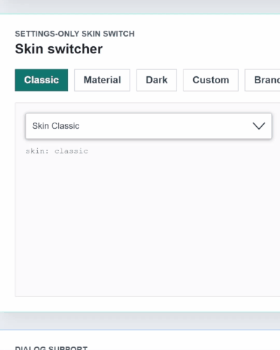
Switch between skins through the settings object:
settings = {
  text: 'Classic basic',
  skin: 'classic'
};

materialSettings = {
  text: 'Material basic',
  skin: 'material'
};
settings.theme is still accepted as a legacy alias for older code, but new Angular usage should configure only settings.skin.
The same twelve scenarios are validated for both classic and material:
| # | Scenario | Main settings tested |
|---|---|---|
| 01 | Basic multi | { enableSearchFilter: false } |
| 02 | Search + select all | Search, select all, clear all, events |
| 03 | Single without checkbox | { singleSelection: true, showCheckbox: false, enableCheckAll: false } |
| 04 | Multi without checkbox | { showCheckbox: false, enableCheckAll: false } |
| 05 | Selection limit | { limitSelection: 2, badgeShowLimit: 2 } |
| 06 | Badge overflow | { badgeShowLimit: 2, maxHeight: 220 } |
| 07 | Grouped by region | { groupBy: 'region', maxHeight: 220 } |
| 08 | Disabled with value | { disabled: true } |
| 09 | Empty data | { noDataLabel: 'No records found' } |
| 10 | Long list with scroll | { maxHeight: 120, badgeShowLimit: 3 } |
| 11 | Local lazy loading | { lazyLoading: true, maxHeight: 120, badgeShowLimit: 3 } |
| 12 | Item + chip template | <c-badge> and <c-item> custom templates |
The Angular line follows the same combobox contract validated in the React 19.1.x work, but exposed through Angular settings:
dropdownSettings = {
  text: 'Keyboard-tested countries',
  enableSearchFilter: true,
  searchAutofocus: false,
  keyboard: {
    space: true,
    spaceOptionAction: 'toggle',
    tab: true,
    arrows: true,
    escape: true,
    backspaceRemovesLastWhenSearchEmpty: false,
    deleteRemovesFocusedBadge: true
  }
};
Default behavior:
- Space on the trigger opens or closes the dropdown.
- Space on an option toggles that option and keeps focus on it.
- Search inputs type a normal space.
- Tab moves focus and never selects an option.
- Escape closes the list without clearing selected values.
- Empty-search Backspace does not remove selected values by default.
- Focused badge/remove buttons can remove intentionally with Backspace/Delete.
- Options expose matching
aria-selectedandaria-checkedvalues.
<angular-multiselect
  [data]="dropdownList"
  [(ngModel)]="selectedItems"
  [settings]="dropdownSettings">
  <c-item>
    <ng-template
      let-item="item"
      let-label="label"
      let-selected="selected"
      let-ariaChecked="ariaChecked">
      <span [attr.data-aria-checked]="ariaChecked">
        {{ label }}
        <strong *ngIf="selected">Selected</strong>
      </span>
    </ng-template>
  </c-item>
</angular-multiselect>
<angular2-multiselect> remains available only as a legacy compatibility alias for applications migrating from the old outdated plugin. New code and all current examples should use <angular-multiselect>.
Use AngularMultiselectState when you want Stackline selection, filtering, item identity, object preservation, and ARIA state while owning all HTML yourself.
import {
  AngularMultiselectState,
  defineAngularMultiselectSettings
} from '@stackline/angular-multiselect-dropdown';

interface CountryOption {
  id: number;
  itemName: string;
  region: string;
}

state = new AngularMultiselectState<CountryOption>({
  data: countries,
  selectedItems: [countries[0]],
  settings: defineAngularMultiselectSettings<CountryOption>({
    primaryKey: 'id',
    labelKey: 'itemName',
    searchBy: ['itemName', 'region'],
    ariaLabel: 'Headless country picker'
  }),
  onChange: (items) => {
    selectedItems = items;
  }
});
The docs include a Headless + ARIA route that binds the returned trigger, listbox, and option state into fully custom Angular HTML.
<form #form="ngForm">
  <angular-multiselect
    [data]="skills"
    [(ngModel)]="selectedSkills"
    [settings]="settings"
    name="skills"
    required>
  </angular-multiselect>
</form><form [formGroup]="userForm">
<angular-multiselect
[data]="skills"
[settings]="settings"
formControlName="skills">
</angular-multiselect>
</form>Enable lazy loading through the settings object and respond to the scroll event from your container logic:
settings = {
  text: 'Select Items',
  enableSearchFilter: true,
  lazyLoading: true,
  labelKey: 'name',
  primaryKey: 'id'
};
The versioned docs include working examples for lazy loading, remote data, grouping, templating, and forms usage.
For sticky cards, constrained containers, or dashboard layouts, keep tagToBody: false so the dropdown panel stays anchored to the field and does not jump across the page.
Use tagToBody: true when the dropdown is inside Angular Material dialogs, modals, drawers, or containers that set overflow: hidden or overflow: auto.
settings = {
  text: 'Select countries',
  enableSearchFilter: true,
  skin: 'material',
  tagToBody: true
};
In the 21.2.x line, tagToBody: true renders the open panel outside clipping containers, keeps it aligned to the original trigger, keeps the menu surface opaque, recalculates position on scroll and resize, and cleans it up on close or destroy. appendToBody: true is also accepted as an alias for teams that prefer that name.
The classic output contract is preserved:
(onSelect)(onDeSelect)(onSelectAll)(onDeSelectAll)(onAddFilterNewItem)
npm install
npm run docs:syncMIT