


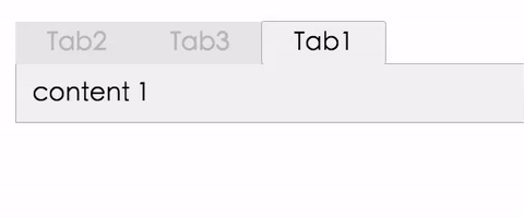
react-tabtab is an api based react tab.

- Add tab
- Delete tab
- Drag and Drop tab
Now only available the commonjs module.
Install it with npm.
npm install react-tabtab --saveSimple example:
var Tabs = require('react-tabtab').Tabs;
var Panel = require('react-tabtab').Panel;

var App = React.createClass({
  render: function() {
    return (
      <Tabs>
        <Panel title="hi">
          Hi!
        </Panel>
        <Panel title="yo" lazy={true}>
          yo yo
        </Panel>
      </Tabs>
    )
  }
})

React.render(<App/>, document.getElementById('container'));
Trigger event on the add tab. Check the example code.
- addBackTab (boolean)
- true : show add tab
- false: hide add tab
- handleAddBackClick (function): trigger the event when user click the tab.

Trigger event on the delete button. Check the example code.
- tabDeleteButton (boolean)
- true : show delete button
- false: hide delete button
- handleTabDeleteButton (function): trigger the event when user click delete button.
The drag and drop feature is based on react-dnd. You can drag the tab to change the sequence.
Because react-dnd can't have two HTML5 backends at the same time (this issue), react-tabtab doesn't wrap the HTML5 in the library.
React-tabtab only wrap the DragSource and DropTarget on the tab, so if you want to use drag and drop, you need to wrap the DragDropContext on your top compoennt. (in case in your project you already have another html5 backend)
In this way, the drag and drop feature in react-tabtab can fit with other dnd library.
Check out the example code and the top component.
- draggable (boolean)
- true : tab can drag
- false: tab can't drag
- beginDrag (function): do something when start to drag
- setMoveData (function)
- return value {dragIndex, hoverIndex}
- dragIndex: current drag tab index
- hoverIndex: current hove tab index
- return value {dragIndex, hoverIndex}
Check the [advanced.jsx](https://github.com/ /ctxhou/react-tabtab/blob/master/example/advanced.jsx).
This example show how to add tab, delete tab, and drag and drop.
| property | type | default | required | description |
|---|---|---|---|---|
| activeKey | int | 0 | no | set the active key of the tab |
| addBackTab | boolean | false | no | whether show a add tab at the end |
| handleAddBackClick | function | n/a | no | callback function when user click the add tab |
| deleteButton | boolean | false | no | whether show a delete button at each panel |
| handleDeleteButton | function | false | no | callback function when user click the delete button |
| handleTabClick | function | n/a | no | return the key which user clicks |
| tabDeleteButton | boolean | false | no | whether each tab show delete button |
| handleTabDeleteButton | function | n/a | no | callback function when click tabDeleteButton |
| style | string | tabtab__default__ | no | the class prefix |
| deleteAllClassname | string | n/a | no | |
| draggable | boolean | false | no | whether tab can drag and drop |
| beginDrag | function | n/a | no | callback function when start drag |
| setMoveData | function | n/a | no | callback function to get current index and hover index |
now only use css as style.
if you want to use the same style as teh demo, just clone the stylesheets/folder.css and inlcude in you project.
npm run build:watch node devServer.js
MIT @ctxhou