Stanford ACMLab Fall 2021 Project by the "Error 404" Group
"If we're going to write about our mistakes we might as well learn from them" - Ashna Khetan, 11:56 P.M., 11/24/21.
Members: Peter Benitez, Ashna Khetan, Isabel Paz Reyes Sieh, Ryan Dwyer
Google Drive Link: https://drive.google.com/drive/folders/1bo-bpnqivSUEJRPGc5Mcju_oC-LWXASB?usp=sharing
Model Class
The model class we chose was a Convolutional Neural Network (CNN). This was chosen as opposed to a logistic regression model or a neural network without convolution layers because CNNs allow for more complex analysis and have layers that can evaluate images.
A logistic regression model takes in data and predicts the probability of an event existing (e.g. if someone will win or lose, if it will rain or not etc.). A single logistic regression model inputs data and linearly separates the events. For example, Figure 1 is a visualization of a logistic regression model that predicts the species of an iris (vericolor or virginica) based on data of petal and sepal length. The data is able to be separated linearly.
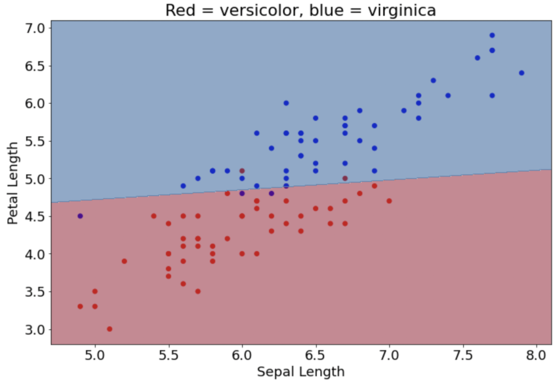
Figure 1: Logistic regression model predicting iris species
This method isn’t applicable for this project because the patterns from satellite images cannot be understood linearly. Instead, a neural network is needed (Figure 2). A neural network consists of many neurons, where each uses logistic regression. Having many neurons allows for more complex decision making. For example, Figure 3 below shows a logistic regression model versus a neural network. The neural network can create curvatures for more advanced predictions.
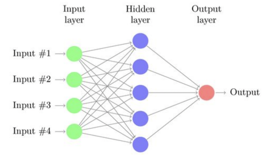
Figure 2: Diagram of a neural network
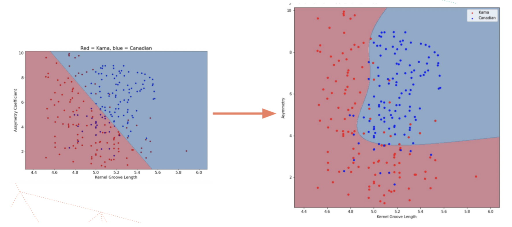
Figure 3: Predicting wheat species using a logistic regression model versus a neural network model
More than just a simple neural network, convolutions are needed for image data. This is because with images, the position of image pixels in relation to each other are important and cannot be evaluated through simple neural network methods. Convolutions find the spatial relationship between features in an image by sliding a filter through the image. For example, in Figure 4 a filter labeled A of a 3 pixel downward slant passes through an input image of an X shape. For each set, the filter is compared to the input image, as shown in label B, through dot multiplication. Label C shows the output after convolution, which represents where the filter pattern appears.

Figure 4: Example of a convolutional layer for an ‘X’ image
In the context of this project, a CNN would allow us to check for patterns in a satellite image, which will help predict the income distribution. Thus, we chose CNN for this project.
Archetypes
Our initial archetype was three convolutional layers each followed by a max pool layer. We then used two fully connected linear layers. Each convolutional and linear layer is also followed by ReLu activation function.
Due to time constraints, we were not able to experiment a lot with different archetypes. However, we chose this general order so we could have convolutional layers to filter the image, and max pool layers to shrink the image. Due to the approaching deadline there wasn’t sufficient time to compare various archetypes. The original archetype that was created is believed to have performed well as the order of the layers help filter out and shrink the image in a logical order. The archetype's performance could have been improved by adding more layers and decreasing the kernel size to optimize performance.
Training the model
In general terms training a model means adjusting parameters or weights so that the accuracy of the model increases. There are three common forms of training models. The first is supervised learning which is when the training data explicitly states what the output of the model should be for the given input. The second is reinforcement learning which is when the training data does not give a correct output for each input but there is a reward signal for correct outputs. The final type of training is unsupervised learning which is when the training data does not contain the correct output or reward signal but relies on probability distribution. The model is given '16zpallnoagi.csv' to create a zipcode to average dictionary. This allows the model to have an explicit correct output for a certain zipcode. This means that the model is trained using supervised learning as the model is trained with knowing what the correct output is. The model is also trained on a set of Los Angeles satellite imagery(figure 5). The combination of having the zipcode to income dictionary and the given set of satellite images are the two resources that were used to train the data through supervised learning.
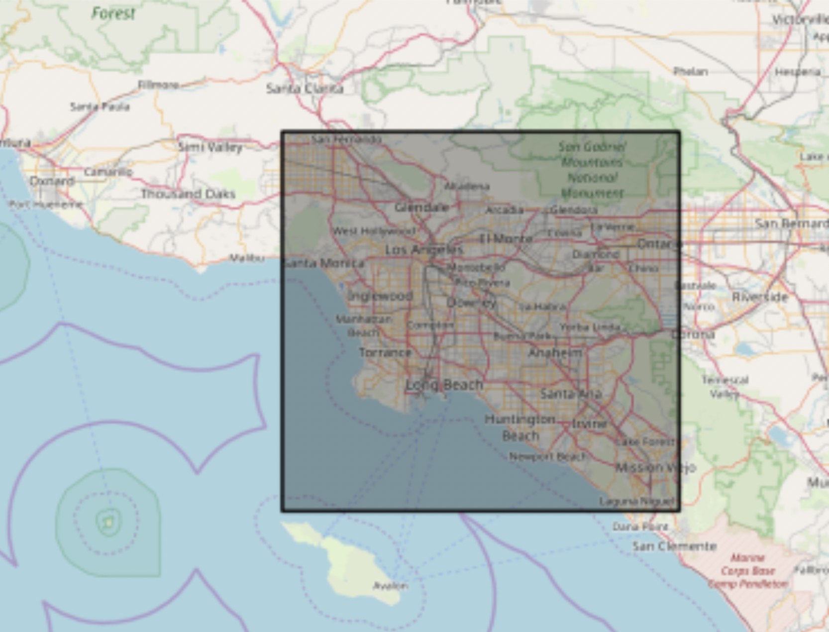
Figure 5: Region from which the training data is provided
Loss
Loss is a number that indicates how far the model’s prediction was from the example. A loss of zero means the prediction is perfect, but when loss is greater that means loss is increasing. In figure 6, the arrow represents loss, the blue lines represent predictions. The left graph contains more loss than the right and thus is further from zero.
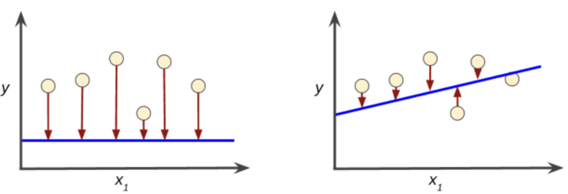
Figure 6: Models depicting high loss on the left and low loss on the right
Certain loss functions are better suited to various types of problems. An example of this is the BCELoss and CrossEntropyLoss functions(Figure 7). These functions are better suited for classification problems as they create a logarithmic graph.
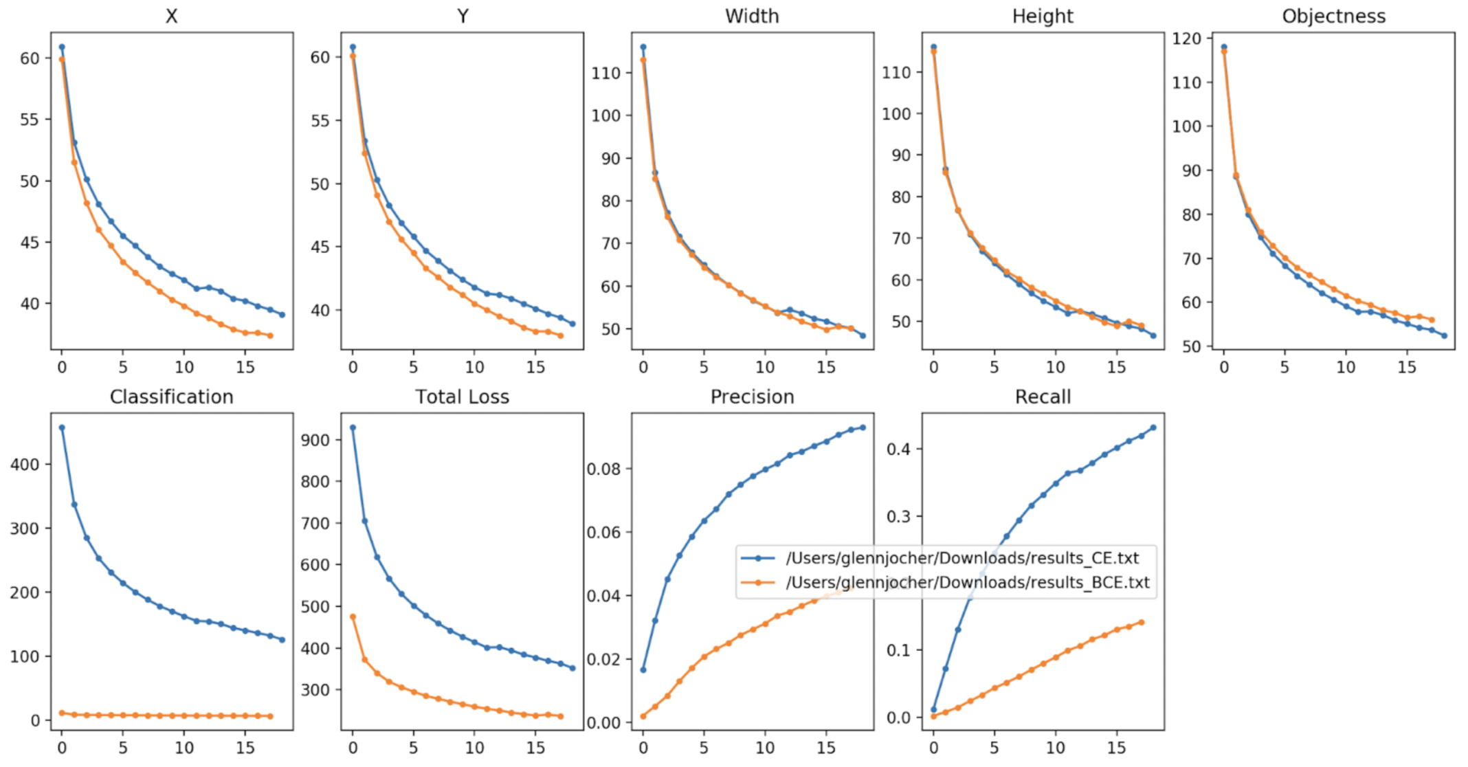
Figure 7: Blue is CrossEntropy and orange is Binary Cross Entropy (BCE)
This project is a linear regression problem(Figure 8) and thus a different set of loss functions need to be tested. The three most common linear regression models are** L1Loss**, MSELoss, and smoothL1Loss(figure 9). The function, description, and their associated results are as follows in Table1.
| Function | Description | Result(Testing Data) |
| torch.nn.L1Loss | Penalizes the mean absolute error | This loss value was unable to be tested as the deadline was approaching and more impactful optimization could be done elsewhere such as in the layers. |
| torch.nn.MSELoss | Penalizes the squared mean absolute error
- Creates a criterion that means mean squared error between each element in the input x and target y |
Creates a parabolic model. The minimum loss is 3. The maximum is 50.The average loss tends to be around 10. This loss function was chosen because of the limited time and how it is in between both other functions. The model graphs can be seen in figure nine and helped inform the decision on choosing the loss function. The accuracy for this loss function was determined by inputting (predicted) / (actual) which is 1.125761589784649. This value means that the loss function was overshooting by .1257%
|
| torch.nn.smoothL1Loss | smooth interpolation between the above two | This loss value was unable to be tested as the deadline was approaching and more impactful optimization could be done elsewhere such as in the layers. |
Table 1: Describes the function and result
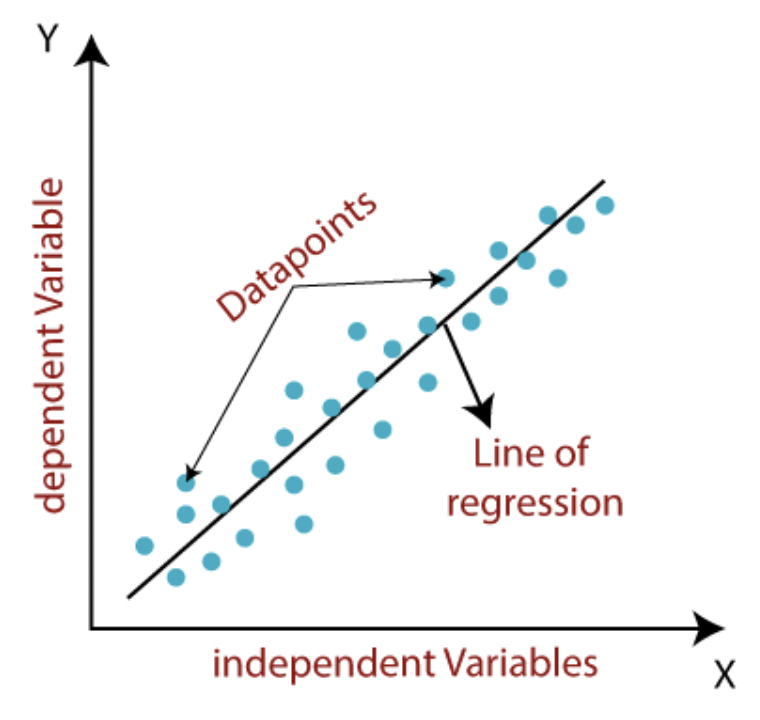
Figure 8: Linear Regression Graph
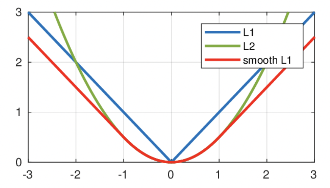
Figure 9: Loss Graphs: Blue is L1, Green is MSE, and red is smoothL1
What hyperparameters did you tune and what results did you see? How can you explain your choice of hyperparameters?
A hyperparameter is a parameter whose value is used to control the learning process. Our hyperparameters involved regularization such as:
torch.nn.utils.clip_grad_norm(model.parameters(), 10)
We also used an epoch size of 200, and used the following optimizer twice:
optimizer = torch.optim.Adam(model.parameters(), lr = 0.001)
These parameters were kept the same. We did, however, tune our loss function. We originally had a BCE loss function because we had used BCE for previous work and were familiar with this loss function. BCE is used for classification and wouldn’t be applicable in this project where we weren’t classifying any data. We therefore later changed the loss function to a more applicable one, a linear regression loss function:
criterion = torch.nn.MSELoss(reduction='sum')
We chose MSELoss since it seems to be in between the two other function options of L1Loss and smoothL1Loss.
Validation and Testing
The model was validated by comparing the actual and predicted distribution income. The initial test set was first a list of random numbers. Another data set was created which was the validation dataset which was ten percent of the original dataset.
Validation Set
After we loaded our dataset of images, we performed a training/testing split, allocating a random 10% of the images into a valid_dataloader and the other 90% into a train_dataloader. This allows us to train our model on a large majority of the data, while testing on a smaller random portion that is not the same each time. While we train our model on the training dataset, we also test it on the validation dataset, calculating our losses for each.
Initially, we just compare the losses and one example of data between the training and testing data with a simple print statement at each step of the epoch. We contrast them by eye, but in order to evaluate overall accuracy, we should compare them on a larger scale.
Therefore, we created an accuracy function that took in a dataset of validation images and outputted an accuracy score: the predicted average income of an image’s area divided by the actual average income of the image’s area.
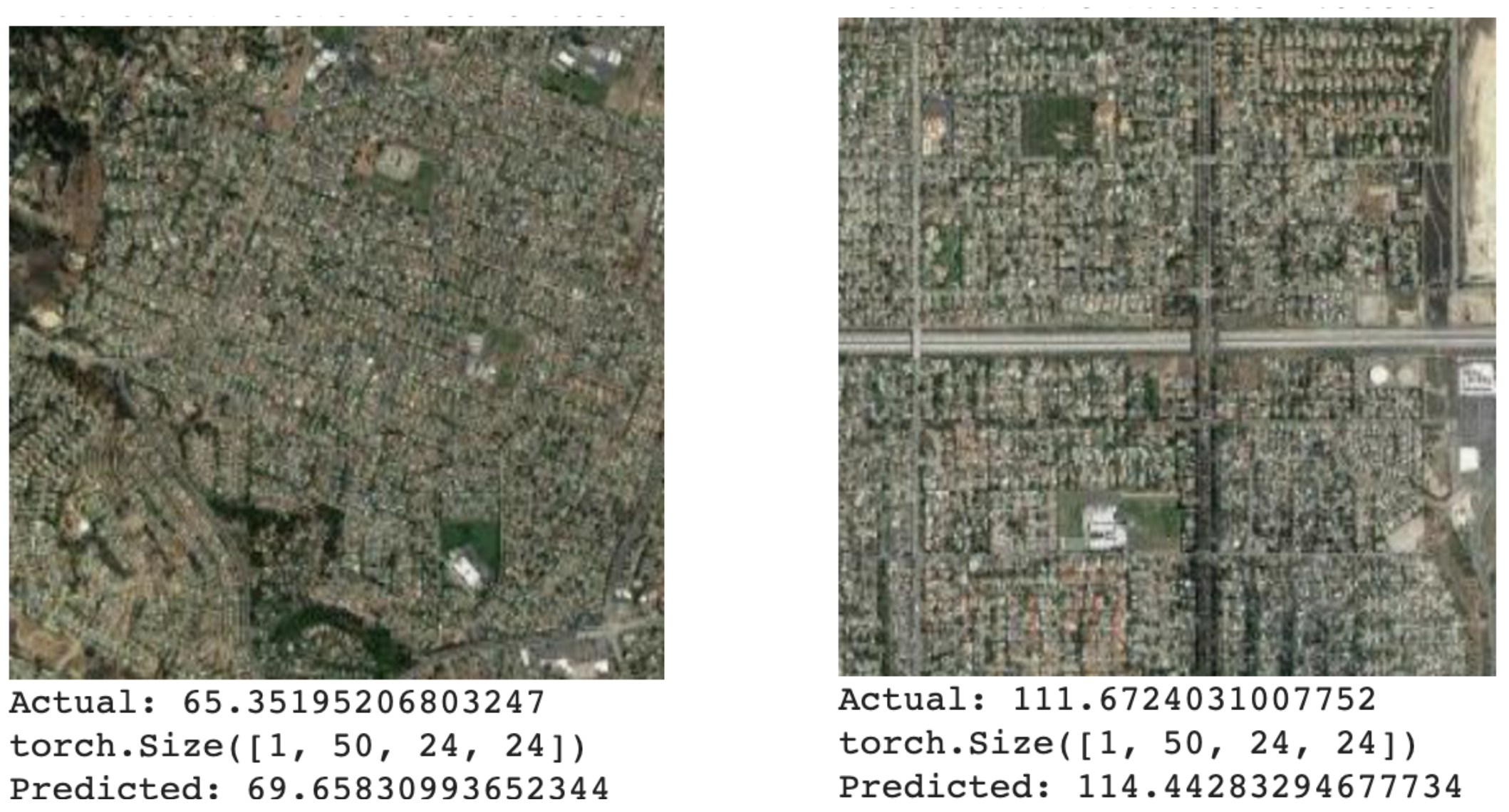
Figure 10: Two examples of satellite images with their actual and predicted average incomes
Underfitting and Overfitting
Our bigger problem initially was underfitting, because we only had 3 convolutional nets with large kernel sizes of 10. However, upon noticing that the loss functions for our training and validation data were very similar, we realized that this was not enough. So ideally, we would add more conv layers with smaller kernel sizes, so to avoid underfit.
To reduce overfitting, we aimed to make our neural network as generalizable as possible and not particular to the training data. We made sure not to make our architecture too detailed, such has having too many layers.
Error analysis
We created loss functions to compare the predictions made by our model on the train data and the actual results in the variable avg_train_loss and did the same with the test data in avg_val_loss.
Can you hypothesize an explanation for errors?
We had limited time and weren’t able to try all the hyperparameters. In a similar 2016 Stanford study that uses machine learning to predict income based on satellite images of nighttime lights in Africa, the “the model the team developed has more than 50 million tunable, data-learned parameters” (Martin). To have more accurate predictions, we would need to dedicate more time to tuning the hyperparameters.
Similarly, another possible explanation for errors is that we are underfitting. As previously explained we have 3 convolutional layers and max pool layers, and 2 linear layers and were unable to change them due to limited time. Had we had more layers we might be able to fit the layers for this model more accurately.
Martin, Glenn. “Stanford Researchers Use Dark of Night and Machine Learning to Shed Light on Global Poverty.” Stanford University, 24 Feb. 2016, https://news.stanford.edu/news/2016/february/satellite-map-poverty-022416.html.