Using Input API
This sdk documentation is deprecated and will not be updated. Check out our new docs at https://sdk.buildfire.com/docs/input-dialog/
The Input API is a framework that allows your plugin to show a full-size view with multiple inputs to get user input data.
Important! The Input API only functions in the widget.
buildfire.input.showTextDialog(options, callback)
Options Object | [Object]
-
placeholder- Will be used as the input's placeholder. -
saveText- Will be used to complete the input and go to next step. -
cancelText- Will be used to cancel the input and return. -
doneText- Will be used when there are multiple steps and you have reached the end. Defaults tosaveText. -
maxLength- set max length of input allowed. (defaults to 2000) -
defaultValue- set pre-existing value of the input. Usually used during edits. -
defaultAttachments- set pre-existing value of the attachments. Usually used during edits. defaultAttachments should not be used along withwysiwygmode-
images- Array of image urls -
gifs- Array of gif urls -
location- Geolocation object{ long, lat, // address_name }
-
-
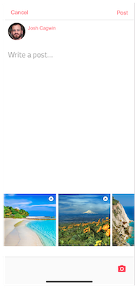
wysiwyg- Boolean, used to switch text input to wysiwyg input -
attachments- Object specifying which attachments to enable-
imagesObject-
{ enable: Boolean, multiple: Boolean } -
gifsObject *{ enable: Boolean }
-
-
Callback Function
(err, data) => { ... }
-
err- If the options are invalid you will receive an error -
data- An object with theresults[]and acancelledproperty that can be true/false. If the input dialog was cancelled, the results array will contain up to where the user reached.- results is an array of the result of each step.
Each result can contain the following properties depending on what was enabled
-
textValue- Text value the user entered. If wysiwyg is true, this will contain plaintext version of wysiwyg input without html tags. -
wysiwygValue- Html of users input. -
images- Array of image urls -
gifs- Array of gif objects -
location- Geolocation object{ long, lat, // address_name }Note: images and gifs object will be empty if wysiwyg is true since these are embedded in wysiwyg content itself and will be returned in value.
data = {
	cancelled: false,
	results: [
		{ textValue: "...", images: [], gifs: [{...}, {...}] }
	]
}
buildfire.input.showTextDialog({
	placeholder:"Enter your title here"
	,saveText:"Set"
	,maxLength:50
	,defaultValue:subscriberTitle.innerHTML
}, (e,response)=>{
	if(e || response.cancelled) return;
	subscriberTitle.innerHTML = response.results[0].textValue;
});
Some times you want the user to enter multiple things in order. To do this you can pass multiple option objects in an array.
Example
const steps = [options1, options2, options3];

buildfire.input.showTextDialog(steps, callback);
buildfire.input.showTextDialog({
	placeholder:"Start typingh..",
	wysiwyg: true
}, (e,response)=>{
	if(e || response.cancelled) return;
	console.log(response.results[0])
});
buildfire.input.showListDialog(options, callback)
Options Object | [Object]
-
title- String. Will render as the dialog's title. -
multiSelect- Boolean. If true, the dialog allows multiple selections and the options render as checkboxes. -
listItems- Array. List of options to present to the user.-
text- String. Title of the option. -
value- String. Value of the option.
-
-
cancelButton- Object-
text- String. This appears as the text in the button. Defaults toCancel -
value- String. This is the value attributed to the button. Defaults tocancel
-
-
confirmButton- Object-
text- String. This appears as the text in the button. Defaults toOk -
value- String. This is the value attributed to the button. Defaults took
-
Callback Function
(error, result) => {...}
-
err- If the options are invalid you will receive an error -
data- An object with theselected[]and acancelledproperty that can be true/false. If the input dialog was cancelled, the selected array will still contain the user's selections.
data = {
	cancelled: false,
	selected: [
		{ value: "..." }
	]
}