Feature/feature timer component#9
Conversation
 MDHayes
left a comment
MDHayes
left a comment
MDHayes
left a comment
There was a problem hiding this comment.
Some feedback:
- The name
TimerComponentseems a little redundant in thecomponentsdirectory. Maybe change this toTimerButton? - Leads onto, this needs a TouchableOpacity wrapping it to start/stop the timer and state that monitors it being started. I think we can do the within the component, although it would give some added flexibility if we passed them in as props. What do you think?
- We're using styles here differently than other places ie Vinod is using
const { textContainerStyle, textStyle } = stylesrather thanstyles.stylename - Remove console.log
- Magic numbers in the timer, the code I suggested had the default set in config this is good practice and will help in future if we want to increase the timer.
- I notice the colours are specific to where they are implemented... what if we changed our minds and want the green to be
#52D9B3?
…rked on suggestions
|
|
PR refreshed as now use only FontAwesome for icons. |
There was a problem hiding this comment.
This needs some more work. Comments inline with the code. Specifically I think this should be reusable on the home page.
You also asked about colors. I've been recommending we have colors generic rather than implementation specific. I think its always easier to add special cases than to have many colors.
I guess this comes down to preference but something to think about when doing colors in future.
| const renderTimer = () => { | ||
| return ( | ||
| <View> | ||
| {timer === 0 ? ( | ||
| <FontAwesome5 name={'thumbs-up'} size={30} color={white} /> | ||
| ) : ( | ||
| <Text style={textSeconds}>{timer}</Text> | ||
| )} | ||
| </View> | ||
| ) | ||
| } |
There was a problem hiding this comment.
Why are we doing a function like this? It should be in the main return or split out. I think this is small enough to put in the return?
Also this button should be reused on the home screen:
That is why you need the TouchableOpcity on it. You would also need to make the icon here generic (was can pass in a name) and the text value changes.
There was a problem hiding this comment.
At homeScreen we just need to show image. there are no progress needed and no state requires for the same. so that we use image at home screen and Circular progress on Timer screen.
There was a problem hiding this comment.
I disagree. The home screen has an icon and text the same, same styling/spacing. I think we can make this one component.
There was a problem hiding this comment.
Ok i have use same component for both Home Screen and Timer Screen by using props.
| } | ||
| }, [timer]) | ||
|
|
||
| const fill = 100 - timer * 5 |
There was a problem hiding this comment.
Magic numbers here. What would happen to the animation if we changed the defaultTimer time to 40 seconds?
There was a problem hiding this comment.
Okay then. What should i do?
There was a problem hiding this comment.
Can you have a think about a solution first?
There was a problem hiding this comment.
what you think about this :
const fill = 100 - (timer * 100) / timerDefault
|
@Bhuvneshwar-MB let me know when this is good to review. Also merge with develop so there's no conflicts in the PR. |
|
I am working on conflicts. i thing some other branch merged in develop branch |
|
Can you please review now? |
Feature/settings screen actions
MDHayes
left a comment
MDHayes
left a comment
There was a problem hiding this comment.
We can do a better job on making the TimerButton more reusable and not having functions returning JSX. Check with Vinod and see if you can work together to improve it, he improved the SelectCell a lot in a similar way.
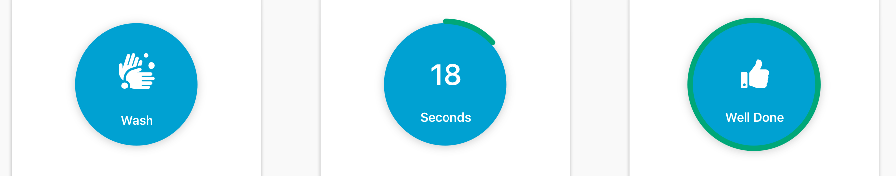
| const renderCircularProgress = () => { | ||
| return ( | ||
| <AnimatedCircularProgress | ||
| style={progressStyle} | ||
| size={200} | ||
| width={10} | ||
| fill={fill} | ||
| rotation={0} | ||
| tintColor={green} | ||
| backgroundColor={white} | ||
| > | ||
| {() => ( | ||
| <View style={viewStyle}> | ||
| <Text style={textSeconds}>{timer}</Text> | ||
| <Text style={textSecondName}>{bottomText}</Text> | ||
| </View> | ||
| )} | ||
| </AnimatedCircularProgress> | ||
| ) | ||
| } | ||
|
|
||
| const renderCircularView = () => { | ||
| return ( | ||
| <View style={circularView}> | ||
| <FontAwesome name={image} size={30} color={white} /> | ||
| <Text style={textSecondName}>{bottomText}</Text> | ||
| </View> | ||
| ) | ||
| } | ||
|
|
||
| return ( | ||
| <View style={container}> |
There was a problem hiding this comment.
This is something we've repeatedly asked not to have in the code. I think Vinod can maybe apply his learning from the SettingCell here, can he support you on this?
|
can you please review now? |
3 participants
I Have Implemented a Time r Component under components on Timer Screen