스피어먼의 로, 켄들의 타우 같은 다른 형태의 상관관계는 값 자체보다 순위를 이용하기 때문에 특잇값에 좀 더 로버스트하고 비선형 관계도 다룰 수 있음
하지만 일반적으로 피어슨 상관계수 혹은 이것의 로버스트한 다른 버전들을 탐색 분석에 주로 사용
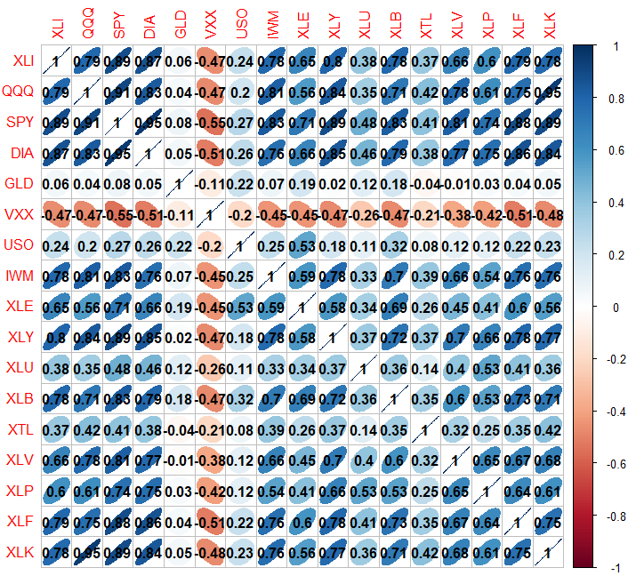
etfs <- sp500_px [row.names(sp500_px ) > " 2012-07-01" sp500_sym [sp500_sym $ sector == " etf" " symbol" etfs ), method = " ellipse" addCoef.col = TRUE )
ellipse를 사용해서 양의 상관관계는 오른쪽으로, 음의 상관관계는 왼쪽으로 뻗어있는 타원으로 표현
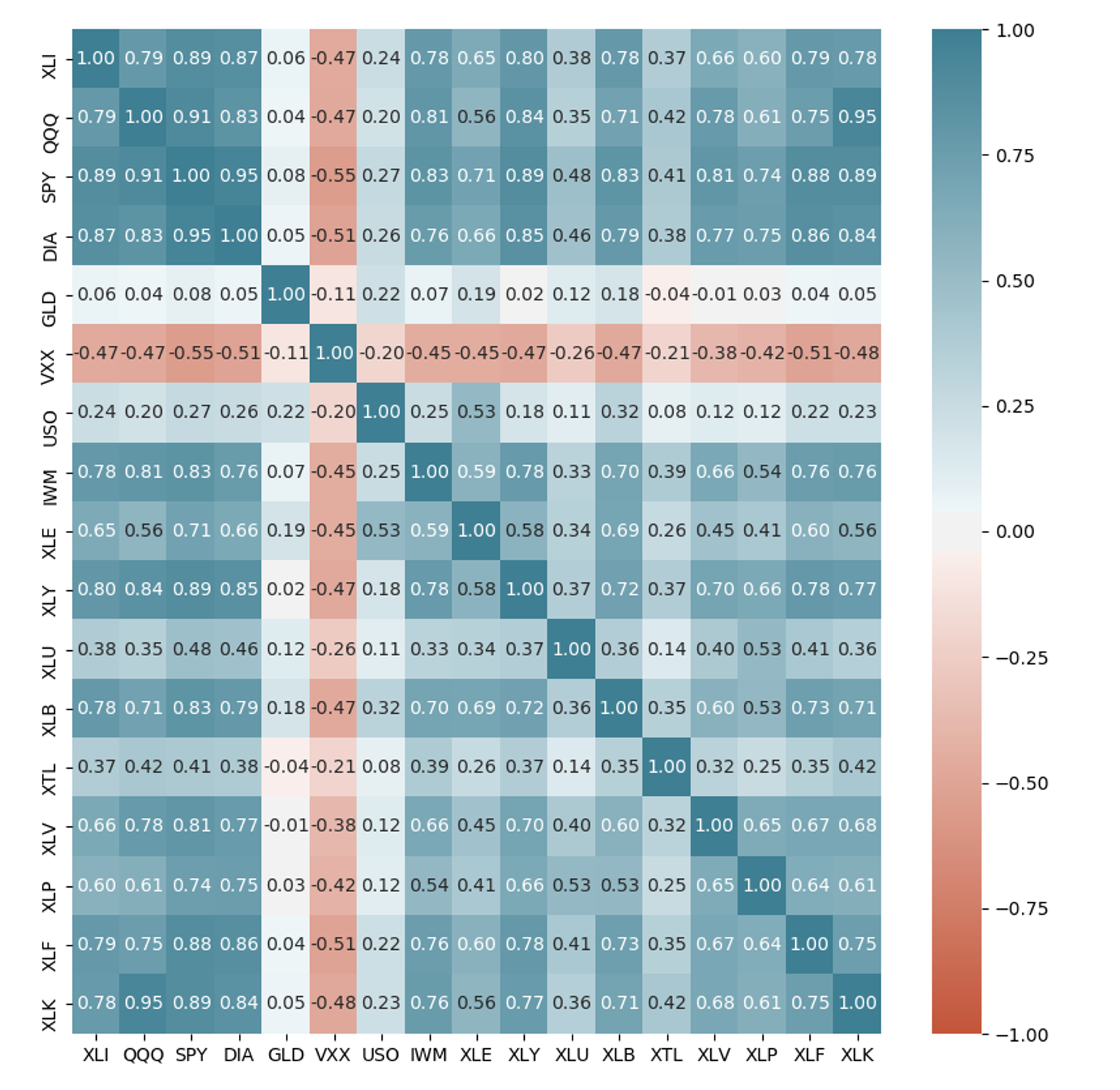
etfs = sp500_px .loc [sp500_px .index > "2012-07-01" , sp500_sym .loc [sp500_sym .sector == "etf" , "symbol" ]]
sns .heatmap (etfs .corr (), vmin = - 1 , vmax = 1 , cmap = sns .diverging_palette (20 , 220 , as_cmap = True ), annot = True , fmt = ".2f" )
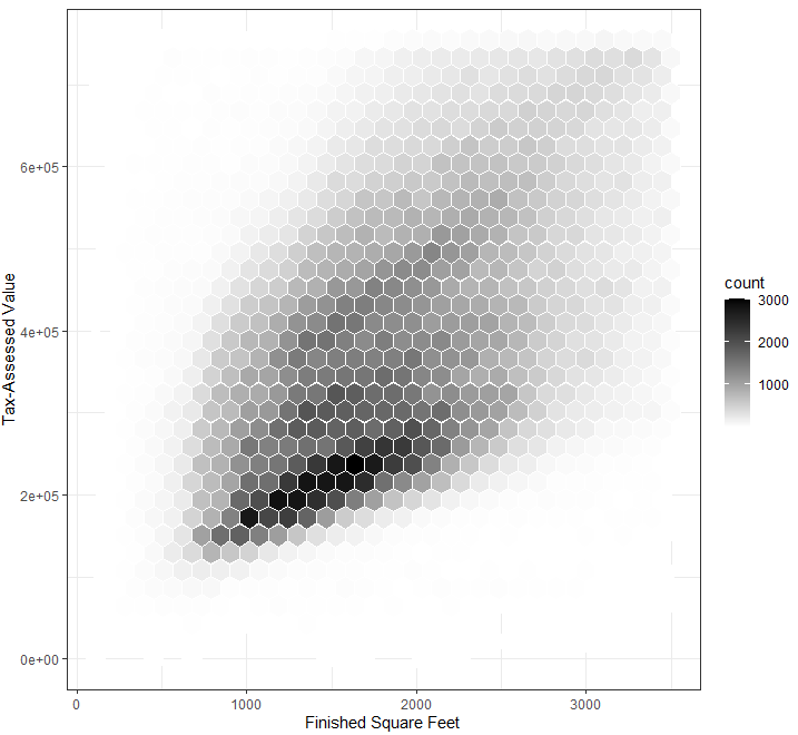
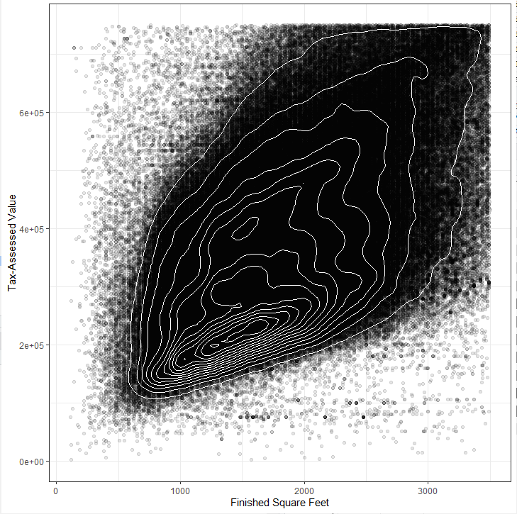
수십, 수백만의 레코드를 나타낼 때 산점도는 점들이 너무 밀집되어 알아보기 어려움
점으로 표시하는 대신 값을 육각형 모양의 구간들로 나누고 각 구간에 포함된 값의 개수에 따라 색깔을 표시
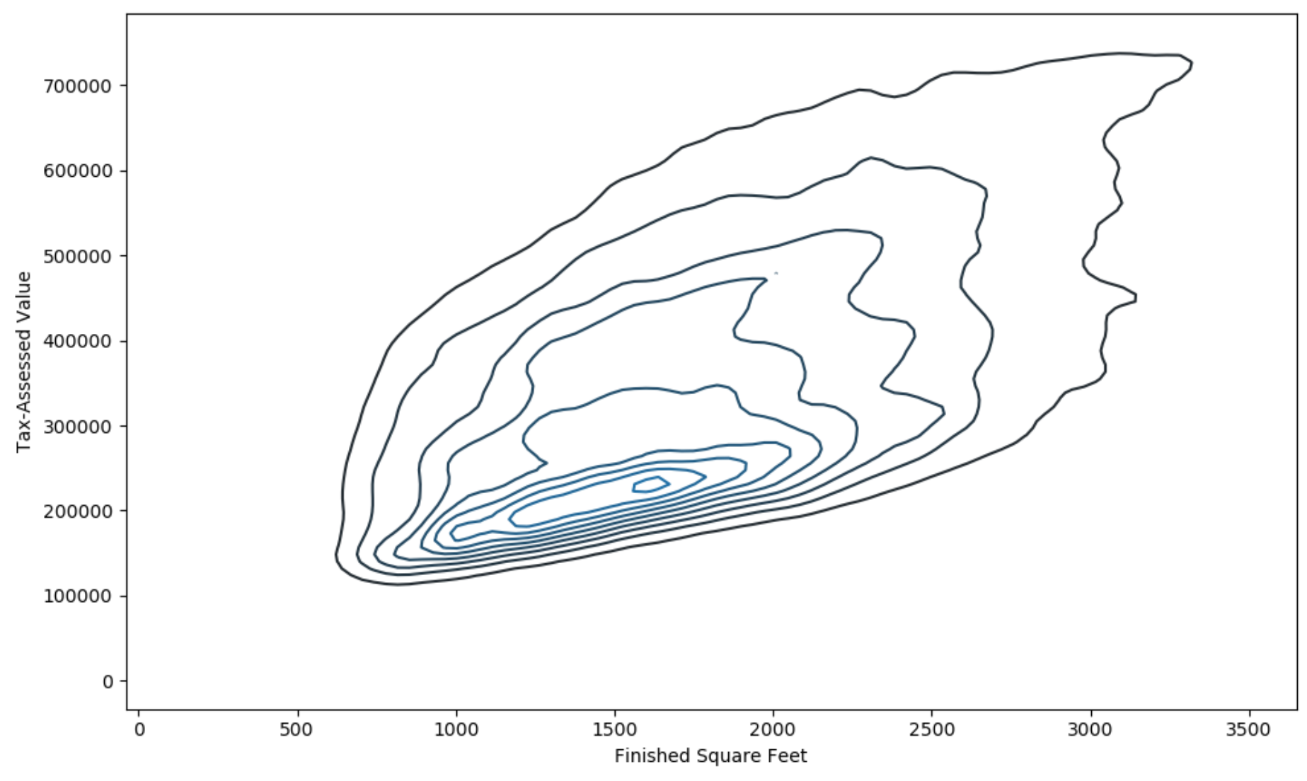
kc_tax0 <- subset(kc_tax , TaxAssessedValue < 750000 & SqFtTotLiving > 100 & SqFtTotLiving < 3500 )
ggplot(kc_tax0 , (aes(x = SqFtTotLiving , y = TaxAssessedValue ))) + stat_binhex(color = " white" + theme_bw()+
scale_fill_gradient(low = " white" high = " black" + labs(x = " Finished Square Feet" y = " Tax-Assessed Value"
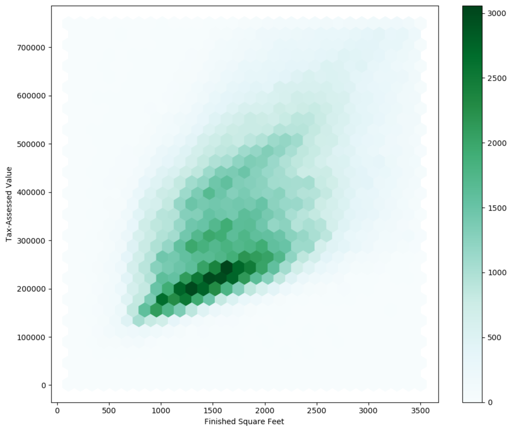
kc_tax0 = kc_tax .loc [(kc_tax ["TaxAssessedValue" ] < 750000 ) & (100 < kc_tax ["SqFtTotLiving" ]) & (kc_tax ["SqFtTotLiving" ] < 3500 ), :]
# gridsize : x축 방향의 육각형 수
ax = kc_tax0 .plot .hexbin (x = "SqFtTotLiving" , y = "TaxAssessedValue" , gridsize = 30 , figsize = (10 , 8 ))
ax .set_xlabel ("Finished Square Feet" )
ax .set_ylabel ("Tax-Assessed Value" )
집의 크기와 과세 평가 금액이 양의 상관관계를 갖는 것을 파악
두 변수로 이루어진 지형에서의 등고선
등고선 위의 점들은 밀도가 같음
library(ggplot2 )
ggplot(kc_tax0 , (aes(x = SqFtTotLiving , y = TaxAssessedValue ))) + theme_bw()+ geom_point(alpha = 0.1 ) +
geom_density2d(color = " white" + labs(x = " Finished Square Feet" y = " Tax-Assessed Value"
fig , ax = plt .subplots (figsize = (10 , 6 ))
sns .kdeplot (kc_tax0 ["SqFtTotLiving" ], kc_tax0 ["TaxAssessedValue" ], ax = ax )
ax .set_xlabel ("Finished Square Feet" )
ax .set_ylabel ("Tax-Assessed Value" )
plt .show ()
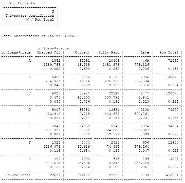
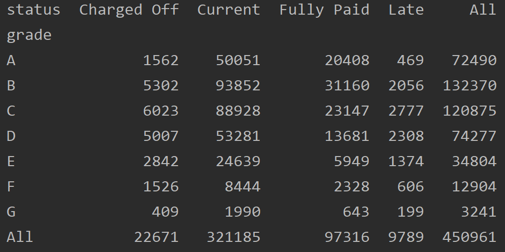
두 범주형 변수를 요약하는 데 효과적인 방법으로 범주별 빈도수를 기록한 표
library(gmodels )
x_tab <- CrossTable(lc_loans $ grade , lc_loans $ status , prop.c = FALSE , prop.chisq = TRUE , prop.t = FALSE )
crosstab = lc_loans .pivot_table (index = "grade" , columns = "status" , aggfunc = len , margins = True )
# pd.crosstab(lc_loans["grade"], lc_loans["status"], margins=True)
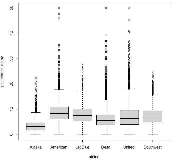
boxplot (범주형 변수 대 수치형 변수) boxplot(pct_carrier_delay ~ airline , data = airline_stats , ylim = c(0 , 50 ))
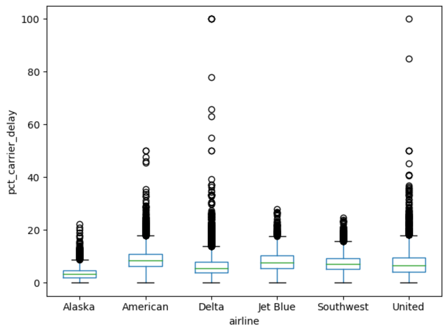
ax = airline_stats .boxplot (by = "airline" , column = "pct_carrier_delay" )
ax .set_ylabel ("pct_carrier_delay" )
ax .set_title ("" )
plt .grid (False )
plt .suptitle ("" )
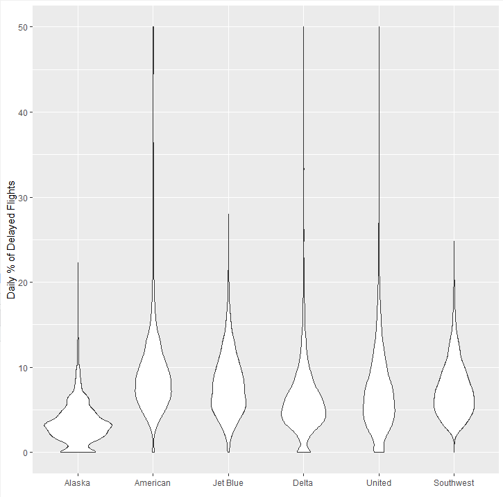
상자그림을 보완한 형태, y축을 따라 밀도추정 결과를 동시에 시각화
밀도 분포 모양을 좌우대칭으로 서로 겹쳐지도록 표현
library(ggplot2 )
ggplot(airline_stats , aes(airline , pct_carrier_delay )) + ylim(0 , 50 ) + geom_violin() + labs(x = " " y = " Daily % of Delayed Flights"
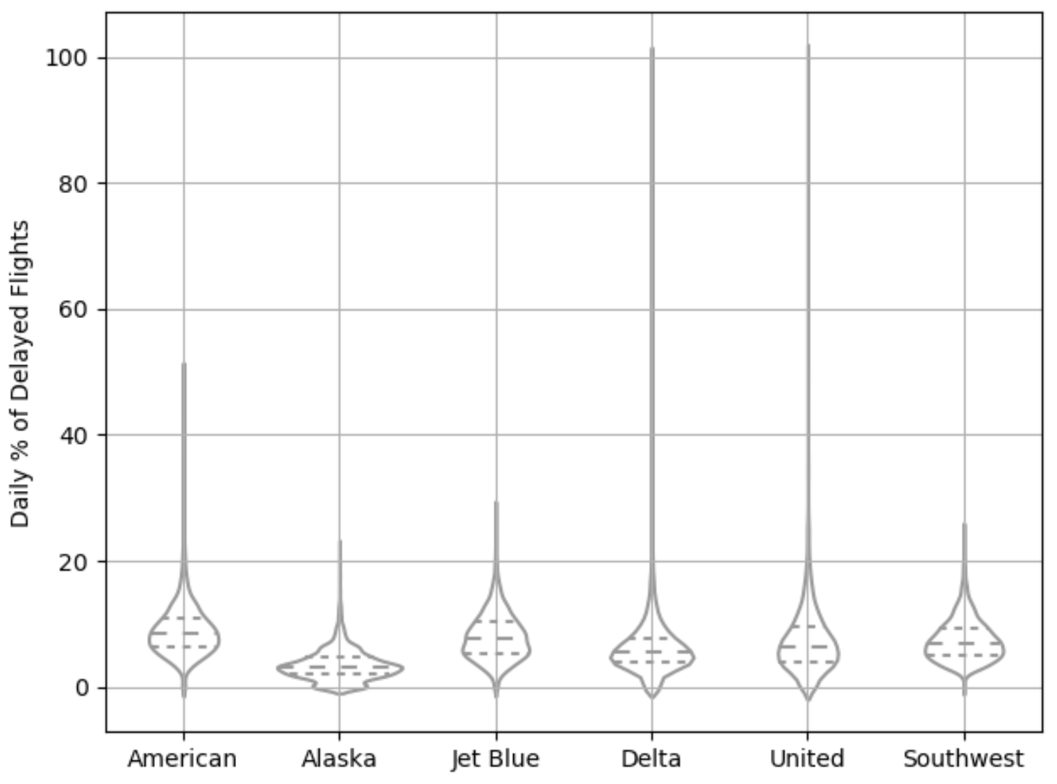
# inner="quartile" : 분포의 사분위수
ax = sns .violinplot (airline_stats ["airline" ], airline_stats ["pct_carrier_delay" ], inner = "quartile" , color = "white" )
ax .set_xlabel ("" )
ax .set_ylabel ("Daily % of Delayed Flights" )
plt .grid (True )
알래스카 항공, 델타 항공이 상대적으로 0 근처에 데이터가 집중되어 있는 것을 볼 수 있음