
| Property |
Type |
Default |
Description |
firstDayOfWeek |
Number |
0 |
First day of week |
showWeekNumber |
Boolean |
false |
If true, week number renders. |
weekNumberType |
String |
first-4-day-week |
Week number type. Possible values: first-day-of-year, first-full-week. |
landscape |
Boolean |
false |
If true, datepicker renders in landscape mode. |
startView |
String |
calendar |
Initial view when datepicker renders. Possible values: yearList. |
min |
String |
|
Minimum date that is selectable/ focusable. Accepts ISO 8601 date format, e.g. 2020-02-02, 2020-02-02T00:00:00.000Z, etc. |
max |
String |
|
Maximum date that is selectable/ focusable. Accepts ISO 8601 date format, e.g. 2020-02-02, 2020-02-02T00:00:00.000Z, etc. |
value |
String |
<today's date> |
Selected/ focused date in the format of yyyy-MM-dd, e.g. 2020-02-02. |
locale |
String |
<System's default locale> |
ISO 639 language code, e.g. en-US. |
disabledDays |
String |
|
Week days to be disabled for selection, e.g. 0,6 disables selection for dates that are weekends (Saturday, Sunday). |
disabledDates |
String |
|
Dates to be disabled for selection. Accepts ISO 8601 date format, e.g. 2020-02-02, 2020-02-02T00:00:00.000Z. |
weekLabel |
String |
Wk |
Label for week number when showWeekNumber is true. |
None
| Event |
Description |
datepicker-first-updated |
Fires when datepicker first renders. Returns { firstFocusableElement, value } where firstFocusableElement is of type HTMLElement and value is of type string, e.g. { firstFocusableElement: <HTMLElement>, value: '2020-02-02' }. |
datepicker-animation-finished |
Fires when drag animation finishes during the switch between calendars. Returns no value. |
datepicker-keyboard-selected |
Fires when datepicker updates its value via keyboard input (Enter or Space key). Returns { value } where value is of type string, e.g. { value: '2020-02-02' }. |
| Custom property |
Default |
Description |
--app-datepicker-accent-color |
#1a73e8 |
Accent color. |
--app-datepicker-bg-color |
#fff |
Background color. |
--app-datepicker-border-bottom-left-radius |
8px |
Radius of outer bottom-left border edge. |
--app-datepicker-border-bottom-right-radius |
8px |
Radius of outer bottom-right border edge. |
--app-datepicker-border-top-left-radius |
8px |
Radius of outer top-left border edge. |
--app-datepicker-border-top-right-radius |
8px |
Radius of outer top-right border edge. |
--app-datepicker-color |
#000 |
Text color. |
--app-datepicker-disabled-day-color |
rgba(0, 0, 0, .35) |
Text color of disabled day. |
--app-datepicker-focused-day-color |
#fff |
Text color of focused day. |
--app-datepicker-selector-color |
rgba(0, 0, 0, .55) |
Text color of selector buttons. |
--app-datepicker-separator-color |
#ddd |
Separator color between selector and calendar. |
--app-datepicker-weekday-color |
rgba(0, 0, 0, .55) |
Text color of weekday. |
It inherits all the properties, events, and custom properties from AppDatepicker by default.
| Property |
Type |
Default |
Description |
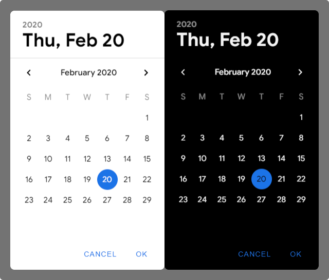
dismissLabel |
String |
cancel |
Label of dismiss button. |
confirmLabel |
String |
ok |
Label of confirm button. |
noFocusTrap |
Boolean |
false |
If true, focus will be trapped inside the datepicker dialog. |
| Method |
Description |
open() |
Open the datepicker dialog. |
close() |
Close the datepicker dialog. |
| Event |
Description |
datepicker-dialog-first-updated |
Fires when datepicker dialog first renders. Returns { value } where value is of type string, e.g. { value: '2020-02-02' }. |
datepicker-dialog-opened |
Fires when datepicker dialog opens. Returns { firstFocusableElement, opened, value } where they are of type HTMLElement, type boolean, and type string respectively, e.g. { firstFocusableElement: <HTMLElement>, opened: true, value: '2020-02-02' }. |
datepicker-dialog-closed |
Fires when datepicker dialog closes. Returns { opened, value } where opened is of type boolean and value is of type string, e.g. { opened: false, value: '2020-02-02' }. |
| Custom property | Default | Description |
| --- | --- | --- | --- |
| --app-datepicker-dialog-border-radius | 8px | Radius of outer border edge. |
| --app-datepicker-dialog-scrim-bg-color | rgba(0, 0, 0, .55) | Background color of dialog's scrim. |
| --app-datepicker-dialog-z-index | 24 | Stack order of datepicker dialog. |