-
Notifications
You must be signed in to change notification settings - Fork 5
Expand file tree
/
Copy pathExploratory Data Analysis.Rmd
More file actions
1078 lines (805 loc) · 38.1 KB
/
Exploratory Data Analysis.Rmd
File metadata and controls
1078 lines (805 loc) · 38.1 KB
1
2
3
4
5
6
7
8
9
10
11
12
13
14
15
16
17
18
19
20
21
22
23
24
25
26
27
28
29
30
31
32
33
34
35
36
37
38
39
40
41
42
43
44
45
46
47
48
49
50
51
52
53
54
55
56
57
58
59
60
61
62
63
64
65
66
67
68
69
70
71
72
73
74
75
76
77
78
79
80
81
82
83
84
85
86
87
88
89
90
91
92
93
94
95
96
97
98
99
100
101
102
103
104
105
106
107
108
109
110
111
112
113
114
115
116
117
118
119
120
121
122
123
124
125
126
127
128
129
130
131
132
133
134
135
136
137
138
139
140
141
142
143
144
145
146
147
148
149
150
151
152
153
154
155
156
157
158
159
160
161
162
163
164
165
166
167
168
169
170
171
172
173
174
175
176
177
178
179
180
181
182
183
184
185
186
187
188
189
190
191
192
193
194
195
196
197
198
199
200
201
202
203
204
205
206
207
208
209
210
211
212
213
214
215
216
217
218
219
220
221
222
223
224
225
226
227
228
229
230
231
232
233
234
235
236
237
238
239
240
241
242
243
244
245
246
247
248
249
250
251
252
253
254
255
256
257
258
259
260
261
262
263
264
265
266
267
268
269
270
271
272
273
274
275
276
277
278
279
280
281
282
283
284
285
286
287
288
289
290
291
292
293
294
295
296
297
298
299
300
301
302
303
304
305
306
307
308
309
310
311
312
313
314
315
316
317
318
319
320
321
322
323
324
325
326
327
328
329
330
331
332
333
334
335
336
337
338
339
340
341
342
343
344
345
346
347
348
349
350
351
352
353
354
355
356
357
358
359
360
361
362
363
364
365
366
367
368
369
370
371
372
373
374
375
376
377
378
379
380
381
382
383
384
385
386
387
388
389
390
391
392
393
394
395
396
397
398
399
400
401
402
403
404
405
406
407
408
409
410
411
412
413
414
415
416
417
418
419
420
421
422
423
424
425
426
427
428
429
430
431
432
433
434
435
436
437
438
439
440
441
442
443
444
445
446
447
448
449
450
451
452
453
454
455
456
457
458
459
460
461
462
463
464
465
466
467
468
469
470
471
472
473
474
475
476
477
478
479
480
481
482
483
484
485
486
487
488
489
490
491
492
493
494
495
496
497
498
499
500
501
502
503
504
505
506
507
508
509
510
511
512
513
514
515
516
517
518
519
520
521
522
523
524
525
526
527
528
529
530
531
532
533
534
535
536
537
538
539
540
541
542
543
544
545
546
547
548
549
550
551
552
553
554
555
556
557
558
559
560
561
562
563
564
565
566
567
568
569
570
571
572
573
574
575
576
577
578
579
580
581
582
583
584
585
586
587
588
589
590
591
592
593
594
595
596
597
598
599
600
601
602
603
604
605
606
607
608
609
610
611
612
613
614
615
616
617
618
619
620
621
622
623
624
625
626
627
628
629
630
631
632
633
634
635
636
637
638
639
640
641
642
643
644
645
646
647
648
649
650
651
652
653
654
655
656
657
658
659
660
661
662
663
664
665
666
667
668
669
670
671
672
673
674
675
676
677
678
679
680
681
682
683
684
685
686
687
688
689
690
691
692
693
694
695
696
697
698
699
700
701
702
703
704
705
706
707
708
709
710
711
712
713
714
715
716
717
718
719
720
721
722
723
724
725
726
727
728
729
730
731
732
733
734
735
736
737
738
739
740
741
742
743
744
745
746
747
748
749
750
751
752
753
754
755
756
757
758
759
760
761
762
763
764
765
766
767
768
769
770
771
772
773
774
775
776
777
778
779
780
781
782
783
784
785
786
787
788
789
790
791
792
793
794
795
796
797
798
799
800
801
802
803
804
805
806
807
808
809
810
811
812
813
814
815
816
817
818
819
820
821
822
823
824
825
826
827
828
829
830
831
832
833
834
835
836
837
838
839
840
841
842
843
844
845
846
847
848
849
850
851
852
853
854
855
856
857
858
859
860
861
862
863
864
865
866
867
868
869
870
871
872
873
874
875
876
877
878
879
880
881
882
883
884
885
886
887
888
889
890
891
892
893
894
895
896
897
898
899
900
901
902
903
904
905
906
907
908
909
910
911
912
913
914
915
916
917
918
919
920
921
922
923
924
925
926
927
928
929
930
931
932
933
934
935
936
937
938
939
940
941
942
943
944
945
946
947
948
949
950
951
952
953
954
955
956
957
958
959
960
961
962
963
964
965
966
967
968
969
970
971
972
973
974
975
976
977
978
979
980
981
982
983
984
985
986
987
988
989
990
991
992
993
994
995
996
997
998
999
1000
---
title: "Exploratory Data Analysis"
output: html_document
---
This document contains information and code from the Coursera "Exploratory Data Analysis" course
# Week 1
The first week focuses on R's base plotting system.
## Classes
Below we see how to create an empty scatter plot so as to add subsets one by one with differing colors.
```{r}
library(datasets)
with(airquality, plot(Wind,Ozone,main="Ozone and Wind in NYC", type="n"))
with(subset(airquality, Month==5), points(Wind,Ozone,col="blue"))
with(subset(airquality, Month!=5), points(Wind,Ozone,col="red"))
legend("topright",pch=1,col=c("blue", "red"), legend = c("May", "Other Months"))
```
From here, adding a regression line is simple:
```{r}
with(airquality, plot(Wind,Ozone,main="Ozone and Wind in NYC", pch=20))
model <- lm(Ozone ~ Wind, airquality)
abline(model,lwd=2)
```
Often we want multiple plots on a single device, this is achieved using the ```par()``` command:
```{r}
par(mfrow = c(1,2))
with(airquality, {
plot(Wind, Ozone, main = "Ozone and Wind")
plot(Solar.R, Ozone, main = "Ozone and Solar Radiation")
})
```
This is highly customisable:
```{r}
par(mfrow = c(1,3), mar = c(4,4,2,1), oma = c(0,0,2,0))
with(airquality, {
plot(Wind, Ozone, main = "Ozone and Wind")
plot(Solar.R, Ozone, main = "Ozone and Solar Radiation")
plot(Temp,Ozone, main = "Ozone and Temperature")
mtext("Ozone and Weather in NYC", outer =T)
})
```
There are actually two approaches to creating a plot. The first, we have been using already and involves calling a function like ```plot(), xyplot() or qplot()```. This automatically sends the plot to the screen after which we annotate it if necessary.
The second method explicitly launches a graphics device. The device MUST then be explicitly closed after annotation:
```
pdf(file="myplot.pdf") # Open PDF device and create file
with(faithful, plot(eruptions, waiting)) # Create plot (sent to file)
title(main="Old Faithful Geyser data") # Annotate plot
dev.off() # Close the pdf file device
```
If you are editing a plot using the screen device and you lie the look of it, you can use the ```dev.copy()``` function to copy it to a file device. Don't forget to close the file device though!
```
with(faithful, plot(eruptions,waiting)) # Create plot on screen device
title(main = "Old Faithful Geyser data") # Add a main title
dev.copy(png, file="geyserplot.png") # copy plot to PNG file
dev.off()
})
```
## Course Project 1
This assignment uses data from the [UC Irvine Machine Learning Repository](http://archive.ics.uci.edu/ml/), a popular repository for machine learning data sets. In particular, we will be using the “Individual household electric power consumption Data Set” which I have made available on the course web site:
Data set: [Electric power consumption](https://d396qusza40orc.cloudfront.net/exdata%2Fdata%2Fhousehold_power_consumption.zip)
Description: Measurements of electric power consumption in one household with a one-minute sampling rate over a period of almost 4 years. Different electrical quantities and some sub-metering values are available.
The following descriptions of the 9 variables in the data set are taken from the [UCI web site](https://archive.ics.uci.edu/ml/datasets/Individual+household+electric+power+consumption):
1. **Date**: Date in format dd/mm/yyyy
2. **Time**: time in format hh:mm:ss
3. **Global_active_power**: household global minute-averaged active power (in kilowatt)
4. **Global_reactive_power**: household global minute-averaged reactive power (in kilowatt)
5. **Voltage**: minute-averaged voltage (in volt)
6. **Global_intensity**: household global minute-averaged current intensity (in ampere)
7. **Sub_metering_1**: energy sub-metering No. 1 (in watt-hour of active energy). It corresponds to the kitchen, containing mainly a dishwasher, an oven and a microwave (hot plates are not electric but gas powered).
8. **Sub_metering_2**: energy sub-metering No. 2 (in watt-hour of active energy). It corresponds to the laundry room, containing a washing-machine, a tumble-drier, a refrigerator and a light.
9. **Sub_metering_3**: energy sub-metering No. 3 (in watt-hour of active energy). It corresponds to an electric water-heater and an air-conditioner.
### Loading the Data
Read raw data into R:
```{r}
data <- read.table("household_power_consumption.txt", header=T, sep=";", quote="",na.strings = "?", nrows=2075260)
```
Convert date and time columns from character strings to the Date/Time class:
```{r}
data$DateTime <- as.POSIXct(paste(data$Date,data$Time), format="%d/%m/%Y %H:%M:%S")
```
Subset the date for the period that we're interested in:
```{r}
data <- subset(data, DateTime >= as.POSIXct("2007-02-01 00:00:00") & DateTime < as.POSIXct("2007-02-03 00:00:00"))
```
Create the first Plot:
```{r}
with(data, hist(Global_active_power, main="Global Active Power", xlab="Global Active Power (kilowatts)", col="red"))
```
...and the second
```{r}
with(data, plot(Global_active_power ~ DateTime, main="", xlab="", ylab="Global Active Power (kilowatts)", type="l"))
```
...and the third
```{r}
with(data, plot(Sub_metering_1 ~ DateTime, main="", xlab="", ylab="Energy sub metering",type="n"))
with(data, lines(Sub_metering_1 ~ DateTime, col="black"))
with(data, lines(Sub_metering_2 ~ DateTime, col="red"))
with(data, lines(Sub_metering_3 ~ DateTime, col="blue"))
legend("topright",lwd=1,col=c("black", "red", "blue"), legend = c("Sub_metering_1", "Sub_metering_2", "Sub_metering_3"))
```
...and the final plot
```{r}
par(mfrow = c(2,2))
with(data, plot(Global_active_power ~ DateTime, main="", xlab="", ylab="Global Active Power", type="l"))
with(data, plot(Voltage ~ DateTime, main="", ylab="Voltage", xlab="datetime", type="l"))
with(data, plot(Sub_metering_1 ~ DateTime, main="", xlab="", ylab="Energy sub metering", type="n"))
with(data, lines(Sub_metering_1 ~ DateTime, col="black"))
with(data, lines(Sub_metering_2 ~ DateTime, col="red"))
with(data, lines(Sub_metering_3 ~ DateTime, col="blue"))
legend("topright",lwd=1,col=c("black", "red", "blue"), legend = c("Sub_metering_1", "Sub_metering_2", "Sub_metering_3"), bty="n")
with(data, plot(Global_reactive_power ~ DateTime, main="", xlab="datetime", type="l"))
```
# Week 2
The second week centres on lattice plot and ggplot2.
## Classes
Below are my notes form the video lectures
### The Lattice Plotting System
The lattice plotting system is implemented using the following packages:
* lattice: contains code for producing Trellis graphics, which are independent of the "base" graphics system; includes functions like xyplot, bwplot, levelplot
* grid: implements a different graphing system independent of the "base" system; the lattice package builds on top of grid
+ We seldom call functions from the grid package directly
* The lattice plotting system does not have a "two-phase" aspect with separate plotting and annotation like in base plotting
* All plotting/annotation is done at once with a single function call
### Lattice Functions
* xyplot: this is the main function for creating scatterplots
* bwplot: box-and-whiskers plots (“boxplots”)
* histogram: histograms
* stripplot: like a boxplot but with actual points
* dotplot: plot dots on "violin strings"
* splom: scatterplot matrix; like pairs in base plotting system
* levelplot, contourplot: for plotting "image" data
Lattice functions generally take a formula for their first argument, usually of the form
```
xyplot(y ~ x | f * g, data)
```
* We use the formula notation here, hence the ```~```.
* On the left of the ```~``` is the y-axis variable, on the right is the x-axis variable
* ```f``` and ```g``` are conditioning variables — they are optional
* the ``` *``` indicates an interaction between two variables
+ The second argument is the data frame or list from which the variables in the formula should be looked up
+ If no data frame or list is passed, then the parent frame is used.
*If no other arguments are passed, there are defaults that can be used.
### Simple Lattice Plot
```{r}
library(lattice)
library(datasets)
## Simple scatterplot
xyplot(Ozone ~ Wind, data = airquality)
```
And another:
```{r}
## Convert 'Month' to a factor variable
airquality <- transform(airquality, Month = factor(Month))
xyplot(Ozone ~ Wind | Month, data = airquality, layout = c(5, 1))
```
### Lattice Behavior
Lattice functions behave differently from base graphics functions in one critical way.
* Base graphics functions plot data directly to the graphics device (screen, PDF file, etc.)
* Lattice graphics functions return an object of class trellis
* The print methods for lattice functions actually do the work of plotting the data on the graphics device.
* Lattice functions return "plot objects" that can, in principle, be stored (but it’s usually better to just save the code + data).
* On the command line, trellis objects are auto-printed so that it appears the function is plotting the data
```{r}
p <- xyplot(Ozone ~ Wind, data = airquality) ## Nothing happens!
print(p) ## Plot appears
```
```
xyplot(Ozone ~ Wind, data = airquality) ## Auto-printing
```
### Lattice Panel Functions
* Lattice functions have a panel function which controls what happens inside each panel of the plot.
* The lattice package comes with default panel functions, but you can supply your own if you want to customize what happens in each panel
* Panel functions receive the x/y coordinates of the data points in their panel (along with any optional arguments)
```{r}
set.seed(10)
x <- rnorm(100)
f <- rep(0:1, each = 50)
y <- x + f - f * x + rnorm(100, sd = 0.5)
f <- factor(f, labels = c("Group 1", "Group 2"))
xyplot(y ~ x | f, layout = c(2, 1)) ## Plot with 2 panels
## Custom panel function
xyplot(y ~ x | f, panel = function(x, y, ...) {
panel.xyplot(x, y, ...) ## First call the default panel function for 'xyplot'
panel.abline(h = median(y), lty = 2) ## Add a horizontal line at the median
})
```
### Lattice Panel Functions: Regression Line
```{r}
xyplot(y ~ x | f, panel = function(x, y, ...) {
panel.xyplot(x, y, ...) ## First call default panel function
panel.lmline(x, y, col = 2) ## Overlay a simple linear regression line
})
```
### Many Panel Lattice Plot: Example from MAACS
* Study: Mouse Allergen and Asthma Cohort Study (MAACS)
* Study subjects: Children with asthma living in Baltimore City, many allergic to mouse allergen
* Design: Observational study, baseline home visit + every 3 months for a year.
* Question: How does indoor airborne mouse allergen vary over time and across subjects?
Ahluwalia et al., Journal of Allergy and Clinical Immunology, 2013

### Summary
* Lattice plots are constructed with a single function call to a core lattice function (e.g. xyplot)
* Aspects like margins and spacing are automatically handled and defaults are usually sufficient
* The lattice system is ideal for creating conditioning plots where you examine the same kind of plot under many different conditions
* Panel functions can be specified/customized to modify what is plotted in each of the plot panels
### What is ggplot2?
* An implementa:on of the Grammar of Graphics by Leland Wilkinson
* Written by Hadley Wickham (while he was a graduate student at Iowa State)
* A "third" graphics system for R (along with base and lattice)
* Available from CRAN via install.packages()
* Web site: http://ggplot2.org (better documenta:on)
* Grammar of graphics represents and abstraction of graphics ideas/objects
* Think "verb", "noun", "adjectiv" for graphics
* Allows for a "theory" of graphics on which to build new graphics and graphics objects
* "Shorten the distance from mind to page"
### Grammar of Graphics
> "In brief, the grammar tells us that a statistical graphic is a mapping from data to aesthetic attributes (colour, shape, size) of geometric objects (points, lines, bars). The plot may also contain statisyical transformayions of the data and is drawn on a specific coordinate system"
### The Basics: qplot()
* Works much like the plot function in base graphics system
* Looks for data in a data frame, similar to lattice, or in the parent environment
* Plots are made up of aesthe4cs (size, shape, color) and geoms (points, lines)
* Factors are important for indicating subsets of the data (if they are to have different properties); they should be labeled
* The qplot() hides what goes on underneath, which is okay for most operations
* ggplot() is the core function and very flexible for doing things qplot() cannot do.
```{r}
library("ggplot2")
qplot(displ, hwy, data=mpg, color=drv)
```
Adding a geom:
```{r}
qplot(displ, hwy, data=mpg, geom=c("point","smooth"))
qplot(displ, hwy, data=mpg, geom=c("point","smooth"), method="lm")
```
Histograms:
```{r}
qplot(hwy, data=mpg, fill=drv)
```
Facets:
```{r}
qplot(displ, hwy, data = mpg, geom = c("point", "smooth"), method = "lm", facets = .~drv)
qplot(hwy, data = mpg, facets = drv~ ., binwidth = 2)
```
Density Smooth:
```{r}
qplot(hwy, data = mpg, geom = "density")
qplot(hwy, data = mpg, geom = "density", color = drv)
```
### Summary of qplot()
* The qplot() function is the analog to plot() but with many built-in features
* Syntax somewhere in between base/lattice
* Produces very nice graphics, essentially publication ready (if you like the design)
* Difficult to go against the grain/customize (don’t bother; use full ggplot2 power in that case).
### Resources
* The ggplot2 book by Hadley Wickham
* The R Graphics Cookbook by Winston Chang (examples in base plots and in ggplot2)
* ggplot2 web site (http://ggplot2.org)
* ggplot2 mailing list (http://goo.gl/OdW3uB), primarily for developers
### What is ggplot2?
* An implementation of the Grammar of Graphics by Leland Wilkinson
* Grammar of graphics represents and abstraction of graphics ideas/objects
* Think "verb", "noun", "adjective" for graphics
* Allows for a "theory" of graphics on which to build new graphics and graphics objects.
### Basic Components of a ggplot2 Plot
* A data frame
* aesthetic mappings: how data are mapped to color, size
* geoms: geometric objects like points, lines, shapes.
* facets: for condional plots.
* stats: statistical transformations like binning, quantiles, smoothing.
* scales: what scale an aesthetic map uses (example: male = red, female = blue).
* coordinate system
### Building Plots with ggplot2
* When building plots in ggplot2 (rather than using qplot) the "artist's palette" model may be the closest analogy
* Plots are built up in layers
+ Plot the data
+ Overlay a summary
+ Metadata and annotation
### Example: BMI, PM2.5, Asthma
* Mouse Allergen and Asthma Cohort Study
* Baltimore children (age 5-17)
* Persistent asthma, exacerbation in past year
* Does BMI (normal vs. overweight) modify the relationship between PM2.5 and asthma symptoms?
Basic plot could be achieved with ```qplot()```
```
qplot(logpm25, NocturnalSympt, data = maacs, facets = . ~ bmicat)
```
### ggplot() builds up in layers:
```
g <- ggplot(maacs, aes(logpm25, NocturnalSympt))
summary(g)
> data: logpm25, bmicat, NocturnalSympt [554x3]
> mapping: x = logpm25, y = NocturnalSympt
> faceting: facet_null()
```
There is still no plot yet!
```
print(g)
> Error: No layers in plot
p <- g + geom_point()
print(p)
> works fine!
```
We can add a smoothing line
```
g + geom_point() + geom_smooth(method = "lm”)
```
and facets
```
g + geom_point() + facet_grid(. ~ bmicat) + geom_smooth(method = "lm")
```
### Annotation
* Labels: xlab(), ylab(), labs(), ggtitle()
* Each of the "geom" func:ons has options to modify
* For things that only make sense globally, use theme()
+ Example: theme(legend.position = "none")
* Two standard appearance themes are included
+ theme_gray(): The default theme (gray background)
+ theme_bw(): More stark/plain
We can specify colours directly:
```
g + geom_point(color = "steelblue”, size = 4, alpha = 1/2)
```
Or use a factor data variable:
```
g + geom_point(aes(color = bmicat), size = 4, alpha = 1/2)
```
We use the ```labs()``` function for customising labels:
```
g + geom_point(aes(color = bmicat)) + labs(title = "MAACS Cohort") + labs(x = expression("log " * PM[2.5]), y = "Nocturnal Symptoms")
```
We can also customize the smoother:
```
g + geom_point(aes(color = bmicat), size = 2, alpha = 1/2) + geom_smooth(size = 4, linetype = 3, method = "lm", se = FALSE)
```
and change the theme:
```
g + geom_point(aes(color = bmicat)) + theme_bw(base_family = "Times")
```
When you set limits in ggplot2, it automatically removes the outliers:
```
g + geom_line() + ylim(-3, 3)
```
### Summary
* ggplot2 is very powerful and flexible if you learn the "grammar" and the various elements that can be tuned/modified
* Many more types of plots can be made; explore and mess around with the package (references men:oned in Part 1 are useful)
## Quiz - wk 2
### Question 1
Under the lattice graphics system, what do the primary plotting functions like xyplot() and bwplot() return?
Answer
an object of class "trellis"
Explanation
```{r}
library(nlme)
library(lattice)
plot <- xyplot(weight ~ Time | Diet, BodyWeight)
class(plot)
```
### Question 2
What is produced by the following code?
```{r}
library(nlme)
library(lattice)
xyplot(weight ~ Time | Diet, BodyWeight)
```
Answer
A set of 3 panels showing the relationship between weight and time for each diet.
### Question 3
Annotation of plots in any plotting system involves adding points, lines, or text to the plot, in addition to customizing axis labels or adding titles. Different plotting systems have different sets of functions for annotating plots in this way. Which of the following functions can be used to annotate the panels in a multi-panel lattice plot?
Answer
```panel.lmline()```
### Question 4
The following code does NOT result in a plot appearing on the screen device.
```
library(lattice)
library(datasets)
data(airquality)
p <- xyplot(Ozone ~ Wind | factor(Month), data = airquality)
```
Which of the following is an explanation for why no plot appears?
Answer
The object 'p' has not yet been printed with the appropriate print method.
### Question 5
In the lattice system, which of the following functions can be used to finely control the appearance of all lattice plots?
Answer
```trellis.par.set()```
### Question 6
What is ggplot2 an implementation of?
Answer
the Grammar of Graphics developed by Leland Wilkinson
### Question 7
Load the `airquality' dataset form the datasets package in R.
```
library(datasets)
data(airquality)
```
I am interested in examining how the relationship between ozone and wind speed varies across each month. What would be the appropriate code to visualize that using ggplot2?
Answer
```
airquality = transform(airquality, Month = factor(Month))
qplot(Wind, Ozone, data = airquality, facets = . ~ Month)
```
### Question 8
What is a geom in the ggplot2 system?
Answer
a plotting object like point, line, or other shape
### Question 9
When I run the following code I get an error:
```
library(ggplot2)
g <- ggplot(movies, aes(votes, rating))
print(g)
```
I was expecting a scatterplot of 'votes' and 'rating' to appear. What's the problem?
Answer
ggplot does not yet know what type of layer to add to the plot.
Explanation
```{r}
library(ggplot2)
g <- ggplot(movies, aes(votes, rating))
print(g)
```
### Question 10
The following code creates a scatterplot of 'votes' and 'rating' from the movies dataset in the ggplot2 package. After loading the ggplot2 package with the library() function, I can run
```
qplot(votes, rating, data = movies)
```
How can I modify the the code above to add a smoother to the scatterplot?
Answer
```{r}
qplot(votes, rating, data = movies) + geom_smooth()
```
# Week 3
## Classes
### Hierarchical Clustering
### Can we find things that are close together?
Clustering organizes things that are close into groups
* How do we define close?
* How do we group things?
* How do we visualize the grouping?
* How do we interpret the grouping?
### Hierarchical clustering
* An agglomerative approach
+ Find closest two things
+ Put them together
+ Find next closest
* Requires
+ A defined distance
+ A merging approach
* Produces a tree showing how close things are to each other
### How do we define close?
* Most important step
+ Garbage in -> garbage out
* Distance or similarity
+ Continuous - euclidean distance
+ Continuous - correlation similarity
+ Binary - manhattan distance
* Pick a distance/similarity that makes sense for your problem
### Example distances - Euclidean
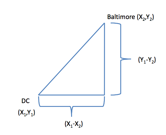
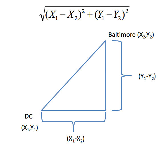
In general:
$$\sqrt{(A_1-A_2)^2 + (B_1-B_2)^2 + \ldots + (Z_1-Z_2)^2}$$
### Example distances - Manhattan

In general:
$$|A_1-A_2| + |B_1-B_2| + \ldots + |Z_1-Z_2|$$
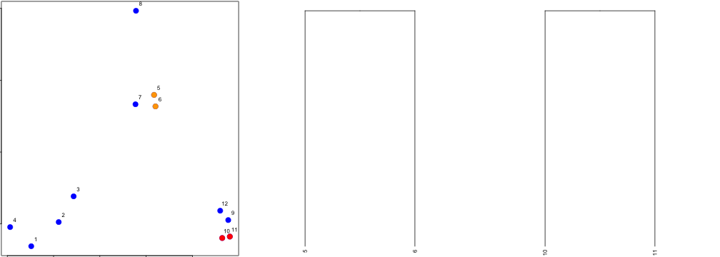
### Hierarchical clustering - example
```{r}
set.seed(1234)
x <- rnorm(12, mean = rep(1:3, each = 4), sd = 0.2)
y <- rnorm(12, mean = rep(c(1, 2, 1), each = 4), sd = 0.2)
plot(x, y, col = "blue", pch = 19, cex = 2)
text(x + 0.05, y + 0.05, labels = as.character(1:12))
```
### Hierarchical clustering - dist
Important parameters: ```x,method```
```{r}
dataFrame <- data.frame(x = x, y = y)
dist(dataFrame)
```
### Hierarchical clustering - #1
### Hierarchical clustering - #2
### Hierarchical clustering - #3
### Hierarchical clustering - hclust
```{r}
distxy <- dist(dataFrame)
hClustering <- hclust(distxy)
plot(hClustering)
```
### Prettier dendrograms
```{r}
myplclust <- function(hclust, lab = hclust$labels, lab.col = rep(1, length(hclust$labels)),
hang = 0.1, ...) {
## modifiction of plclust for plotting hclust objects *in colour*! Copyright
## Eva KF Chan 2009 Arguments: hclust: hclust object lab: a character vector
## of labels of the leaves of the tree lab.col: colour for the labels;
## NA=default device foreground colour hang: as in hclust & plclust Side
## effect: A display of hierarchical cluster with coloured leaf labels.
y <- rep(hclust$height, 2)
x <- as.numeric(hclust$merge)
y <- y[which(x < 0)]
x <- x[which(x < 0)]
x <- abs(x)
y <- y[order(x)]
x <- x[order(x)]
plot(hclust, labels = FALSE, hang = hang, ...)
text(x = x, y = y[hclust$order] - (max(hclust$height) * hang), labels = lab[hclust$order],
col = lab.col[hclust$order], srt = 90, adj = c(1, 0.5), xpd = NA, ...)
}
myplclust(hClustering, lab = rep(1:3, each = 4), lab.col = rep(1:3, each = 4))
```
### Even Prettier dendrograms
Can be found in the R gallery. There are some really nice ones.
### Merging points - complete
### Merging points - average
### heatmap()
```{r}
dataMatrix <- as.matrix(dataFrame)[sample(1:12), ]
heatmap(dataMatrix)
```
### Notes and further resources
* Gives an idea of the relationships between variables/observations
* The picture may be unstable
+ Change a few points
+ Have different missing values
+ Pick a different distance
+ Change the merging strategy
+ Change the scale of points for one variable
* But it is deterministic
* Choosing where to cut isn't always obvious
* Should be primarily used for exploration
* [Rafa's Distances and Clustering Video](http://www.youtube.com/watch?v=wQhVWUcXM0A)
* [Elements of statistical learning](http://www-stat.stanford.edu/~tibs/ElemStatLearn/)
### K Means Clustering
* A partioning approach
+ Fix a number of clusters
+ Get "centroids" of each cluster
+ Assign things to closest centroid
+ Reclaculate centroids
* Requires
+ A defined distance metric
+ A number of clusters
+ An initial guess as to cluster centroids
* Produces
+ Final estimate of cluster centroids
+ An assignment of each point to clusters
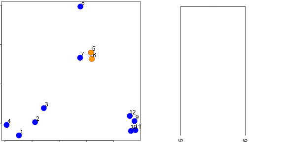
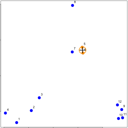
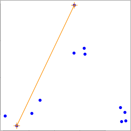
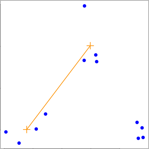
### K-means clustering - example
```{r}
plot(x, y, col = "blue", pch = 19, cex = 2)
text(x + 0.05, y + 0.05, labels = as.character(1:12))
```
Starting centroids
Assign to closest centroid
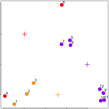
Recalculate centroids
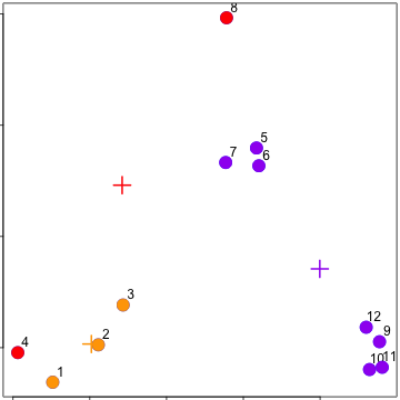
Reassign values
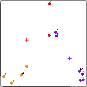
Update centroids
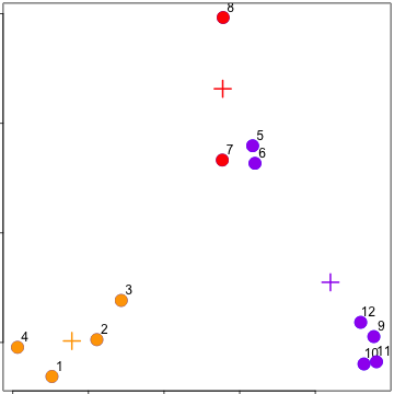
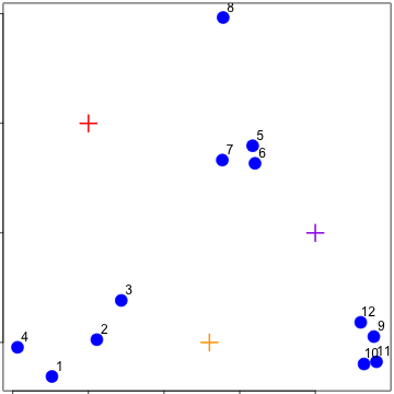
### kmeans()
Important parameters: ```x, centers, iter.max, nstart```
```{r}
kmeansObj <- kmeans(dataFrame, centers = 3)
names(kmeansObj)
kmeansObj$cluster
```
```{r}
par(mar = rep(1, 4))
plot(x, y, col = kmeansObj$cluster, pch = 19, cex = 2)
points(kmeansObj$centers, col = 1:3, pch = 3, cex = 3, lwd = 3)
```
### Heatmaps
```{r}
kmeansObj2 <- kmeans(dataMatrix, centers = 3)
par(mfrow = c(1, 2), mar = c(2, 4, 1, 1))
image(t(dataMatrix)[, nrow(dataMatrix):1], yaxt = "n")
image(t(dataMatrix)[, order(kmeansObj$cluster)], yaxt = "n")
```
### Notes and further resources
* K-means requires a number of clusters
+ Pick by eye/intuition
+ Pick by cross validation/information theory, etc.
+ Determining the number of clusters
* K-means is not deterministic
+ Different # of clusters
+ Different number of iterations
* Rafael Irizarry's Distances and Clustering Video
* Elements of statistical learning
### Principal Components Analysis and Singular Value Decomposition
### Matrix data
```{r}
par(mar = rep(1, 4))
dataMatrix <- matrix(rnorm(400), nrow = 40)
image(1:10, 1:40, t(dataMatrix)[, nrow(dataMatrix):1])
heatmap(dataMatrix)
```
### What if we add a pattern?
```{r}
set.seed(678910)
for (i in 1:40) {
# flip a coin
coinFlip <- rbinom(1, size = 1, prob = 0.5)
# if coin is heads add a common pattern to that row
if (coinFlip) {
dataMatrix[i, ] <- dataMatrix[i, ] + rep(c(0, 3), each = 5)
}
}
heatmap(dataMatrix)
```
### Patterns in rows and columns
```{r}
hh <- hclust(dist(dataMatrix))
dataMatrixOrdered <- dataMatrix[hh$order, ]
par(mfrow = c(1, 3))
image(t(dataMatrixOrdered)[, nrow(dataMatrixOrdered):1])
plot(rowMeans(dataMatrixOrdered), 40:1, , xlab = "Row Mean", ylab = "Row", pch = 19)
plot(colMeans(dataMatrixOrdered), xlab = "Column", ylab = "Column Mean", pch = 19)
```
### Related problems
You have multivariate variables $X_1,\ldots,X_n$ so $X_1 = (X_{11},\ldots,X_{1m})$
* Find a new set of multivariate variables that are uncorrelated and explain as much variance as possible.
* If you put all the variables together in one matrix, find the best matrix created with fewer variables (lower rank) that explains the original data.
The first goal is statistical and the second goal is data compression.
### Related solutions - PCA/SVD
SVD
If X is a matrix with each variable in a column and each observation in a row then the SVD is a "matrix decomposition"
$$X = UDV^T$$
where the columns of U are orthogonal (left singular vectors), the columns of V are orthogonal (right singular vectors) and D is a diagonal matrix (singular values).
PCA
The principal components are equal to the right singular values if you first scale (subtract the mean, divide by the standard deviation) the variables.
### Components of the SVD - u and v
```{r}
svd1 <- svd(scale(dataMatrixOrdered))
par(mfrow = c(1, 3))
image(t(dataMatrixOrdered)[, nrow(dataMatrixOrdered):1])
plot(svd1$u[, 1], 40:1, , xlab = "Row", ylab = "First left singular vector", pch = 19)
plot(svd1$v[, 1], xlab = "Column", ylab = "First right singular vector", pch = 19)
```
### Components of the SVD - Variance explained
```{r}
par(mfrow = c(1, 2))
plot(svd1$d, xlab = "Column", ylab = "Singular value", pch = 19)
plot(svd1$d^2/sum(svd1$d^2), xlab = "Column", ylab = "Prop. of variance explained", pch = 19)
```
### Relationship to principal components
```{r}
par(mfrow = c(1, 1))
svd1 <- svd(scale(dataMatrixOrdered))
pca1 <- prcomp(dataMatrixOrdered, scale = TRUE)
plot(pca1$rotation[, 1], svd1$v[, 1], pch = 19, xlab = "Principal Component 1", ylab = "Right Singular Vector 1")
abline(c(0, 1))
```
### Components of the SVD - variance explained
```{r}
constantMatrix <- dataMatrixOrdered*0
for(i in 1:dim(dataMatrixOrdered)[1]){constantMatrix[i,] <- rep(c(0,1),each=5)}
svd1 <- svd(constantMatrix)
par(mfrow=c(1,3))
image(t(constantMatrix)[,nrow(constantMatrix):1])
plot(svd1$d,xlab="Column",ylab="Singular value",pch=19)
plot(svd1$d^2/sum(svd1$d^2),xlab="Column",ylab="Prop. of variance explained",pch=19)
```
### What if we add a second pattern?
```{r}
set.seed(678910)
for (i in 1:40) {
# flip a coin
coinFlip1 <- rbinom(1, size = 1, prob = 0.5)
coinFlip2 <- rbinom(1, size = 1, prob = 0.5)
# if coin is heads add a common pattern to that row
if (coinFlip1) {
dataMatrix[i, ] <- dataMatrix[i, ] + rep(c(0, 5), each = 5)
}
if (coinFlip2) {
dataMatrix[i, ] <- dataMatrix[i, ] + rep(c(0, 5), 5)
}
}
hh <- hclust(dist(dataMatrix))
dataMatrixOrdered <- dataMatrix[hh$order, ]
```
### Singular value decomposition - true patterns
```{r}
svd2 <- svd(scale(dataMatrixOrdered))
par(mfrow = c(1, 3))
image(t(dataMatrixOrdered)[, nrow(dataMatrixOrdered):1])
plot(rep(c(0, 1), each = 5), pch = 19, xlab = "Column", ylab = "Pattern 1")
plot(rep(c(0, 1), 5), pch = 19, xlab = "Column", ylab = "Pattern 2")
```
### v and patterns of variance in rows
```{r}
svd2 <- svd(scale(dataMatrixOrdered))
par(mfrow = c(1, 3))
image(t(dataMatrixOrdered)[, nrow(dataMatrixOrdered):1])
plot(svd2$v[, 1], pch = 19, xlab = "Column", ylab = "First right singular vector")
plot(svd2$v[, 2], pch = 19, xlab = "Column", ylab = "Second right singular vector")
```
# d and variance explained
```{r}
svd1 <- svd(scale(dataMatrixOrdered))
par(mfrow = c(1, 2))
plot(svd1$d, xlab = "Column", ylab = "Singular value", pch = 19)
plot(svd1$d^2/sum(svd1$d^2), xlab = "Column", ylab = "Percent of variance explained",
pch = 19)
```
### Notes and further resources
* Scale matters
* PC's/SV's may mix real patterns
* Can be computationally intensive
* [Advanced data analysis from an elementary point of view](http://www.stat.cmu.edu/~cshalizi/ADAfaEPoV/ADAfaEPoV.pdf)
* [Elements of statistical learning](http://www-stat.stanford.edu/~tibs/ElemStatLearn/)
* Alternatives
+ [Factor analysis](http://en.wikipedia.org/wiki/Factor_analysis)
+ [Independent components analysis](http://en.wikipedia.org/wiki/Independent_component_analysis)
+ [Latent semantic analysis](http://en.wikipedia.org/wiki/Latent_semantic_analysis)
## Assignment 2 - week 3
### Introduction
Fine particulate matter (PM2.5) is an ambient air pollutant for which there is strong evidence that it is harmful to human health. In the United States, the Environmental Protection Agency (EPA) is tasked with setting national ambient air quality standards for fine PM and for tracking the emissions of this pollutant into the atmosphere. Approximatly every 3 years, the EPA releases its database on emissions of PM2.5. This database is known as the National Emissions Inventory (NEI). You can read more information about the NEI at the EPA National Emissions Inventory web site.
For each year and for each type of PM source, the NEI records how many tons of PM2.5 were emitted from that source over the course of the entire year. The data that you will use for this assignment are for 1999, 2002, 2005, and 2008.
### Data
The data for this assignment are available from the course web site as a single zip file:
The zip file contains two files:
PM2.5 Emissions Data (summarySCC_PM25.rds): This file contains a data frame with all of the PM2.5 emissions data for 1999, 2002, 2005, and 2008. For each year, the table contains number of tons of PM2.5 emitted from a specific type of source for the entire year.
* fips: A five-digit number (represented as a string) indicating the U.S. county
* SCC: The name of the source as indicated by a digit string (see source code classification table)
* Pollutant: A string indicating the pollutant
* Emissions: Amount of PM2.5 emitted, in tons
* type: The type of source (point, non-point, on-road, or non-road)
* year: The year of emissions recorded
Source Classification Code Table (Source_Classification_Code.rds): This table provides a mapping from the SCC digit strings in the Emissions table to the actual name of the PM2.5 source. The sources are categorized in a few different ways from more general to more specific and you may choose to explore whatever categories you think are most useful. For example, source “10100101” is known as “Ext Comb /Electric Gen /Anthracite Coal /Pulverized Coal”.
You can read each of the two files using the readRDS() function in R. For example, reading in each file can be done with the following code:
```{r}
## This first line will likely take a few seconds. Be patient!
NEI <- readRDS("./data/summarySCC_PM25.rds")
SCC <- readRDS("./data/Source_Classification_Code.rds")
```
### Assignment
The overall goal of this assignment is to explore the National Emissions Inventory database and see what it say about fine particulate matter pollution in the United states over the 10-year period 1999–2008. You may use any R package you want to support your analysis.
Questions
You must address the following questions and tasks in your exploratory analysis. For each question/task you will need to make a single plot. Unless specified, you can use any plotting system in R to make your plot.
Have total emissions from PM2.5 decreased in the United States from 1999 to 2008? Using the base plotting system, make a plot showing the total PM2.5 emission from all sources for each of the years 1999, 2002, 2005, and 2008.
```{r}
Emissions <- aggregate(NEI[, 'Emissions'], by = list(NEI$year), FUN = sum)
Emissions$PM <- round(Emissions[, 2] / 1000, 2)
png(filename = "plot1.png")
barplot(Emissions$PM, names.arg = Emissions$Group.1, main = expression('Total Emission of PM'[2.5]), xlab = 'year', ylab = expression(paste('PM', ''[2.5], ' / Kilotons')), col="blue")
dev.off()
```